One of the most popular questions I hear from artists is some variation on ‘how can I make a painting more abstract?’
So many of us come from a background that told us ‘good art = realistic art”, and it can be hard to break away from that into something more abstract and expressive.
And it doesn’t take much exploring to discover that making effective abstract art is a lot harder than it might first appear!
Making a painting more abstract, or, as I would call it, abstractifying, is essentially a process of simplification, which is not to say the result won’t be rich and complex.
It involves a combo of intuitive and deliberate decisions, between which you dance as you bring a painting to life.
Below are sixteen practical ways you can begin make your paintings more abstract.
You certainly don’t have to use them all, and I suggest not trying to right away – way too overwhelming!
Focusing on one thing at a time allows you to fully explore its potential and integrate it into your natural way of painting. Or not.
I’m focusing on acrylics but most, if not all, of these suggestions can be used with oils too, and some with watercolours or other mediums.
If you decide to try any of them, call it an experiment to take the pressure off. Just notice in what ways trying something new or different affects the kind of art you create. If you don’t like it, try something else!
{Some affiliate links included.}
1. Doing and undoing
Many artists work this way – adding and removing repeatedly throughout a painting.
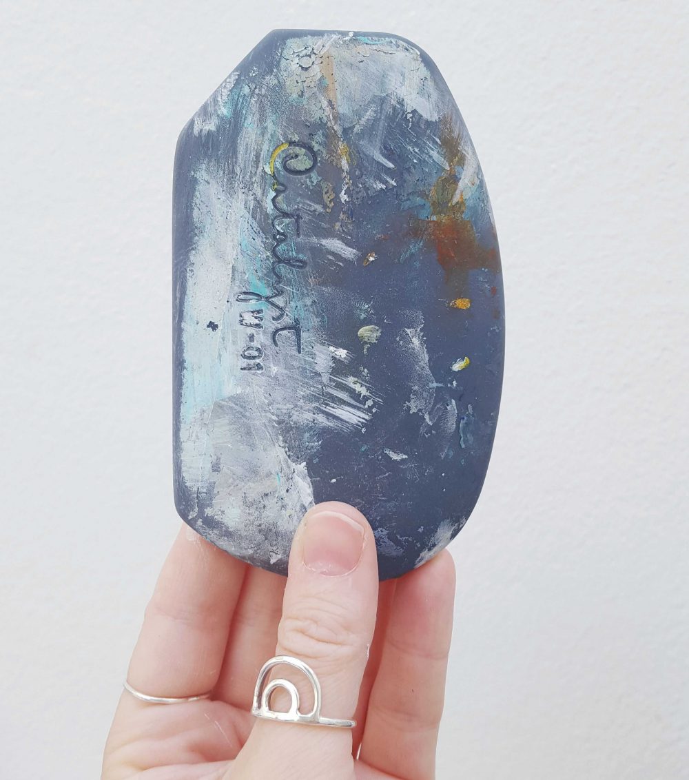
It’s not just about removing ‘mistakes’; taking off paint tends to leave an interesting residue, and layers can be built up quite subtly this way, with hints of what went before being revealed here and there. I usually use my catalyst wedge or a baby wipe or rag to remove paint.
Try this: For every two or three marks you make, ‘undo’ one. It’s challenging, but will really help you understand so many things about painting – non attachment, what layers can do, the impact a tiny splash of incidental colour can have, how ideas about time and history and human nature can be expressed, and on and on.
2. Edit edit edit
A successful painting has often been ruthlessly edited, whether on the canvas itself or from thousands of hours of making art and learning what doesn’t need to be included. Realistic art tends to include everything you can see; to move away from that you need to start leaving things out.
How can you reduce something down to its essence?
For example, in many of my paintings I like to include the idea of steps or ladders; I started out drawing the steps in in a 3D way, and kept editing until it just became a series of wonky lines, as in the bottom left corner of this one:
Try this: Take out the non essentials as much as you can; it won’t always be clear what these are until you take action but you can lay a piece of coloured or white paper over an area you’re thinking of editing to get a feel for how it might look. Or practice reducing an image you love to its simplest form in your sketchbook.
3. Unify with glazes
A glaze will bring a painting or section of a painting together when things are looking a bit scattered. Layers of glazes can create a translucent glow. You can buy all sorts of mediums to create glazes, like this one by Golden or this one by Liquitex.
You can use water to create glazes but bear in mind it breaks down the binders in acrylics and can make them lose their archival abilities and/or lightfastness in the long term.
Try this: Buy a small bottle of glazing liquid and start playing with adding varying amounts of it to your acrylics to see what kinds of effects you can make. When you feel like you have a good idea of how it works, try using a glaze to bring a painting together as its final stage.
4. Use larger tools to help relinquish control
Often when you’re used to making more realistic art, the habit of perfecting can create difficulties when transitioning to more expressive abstract work. Decorator’s brushes, a catalyst wedge, credit cards, randomly chosen collage, squeegee, roller, hands, or any number of other things that aren’t tiny paintbrushes will help you move away from fiddliness and soften everything up.
Consider going in only towards the end with a small brush or pen for details.
Try this: Try making a short series of paintings using only large and unwieldy tools. This will force you to find inventive ways to make expressive marks that aren’t all the same or tiny and fiddly. I find a quick and fun way to do this is to lay out a few pieces of paper and work on them all together, doing one mark on each before changing colour or tool, like this.
5. Allow paint to follow its nature
Paint has its own personality and quirks the same as we do. If you let it do its thing, it can bring spontaneity and the unexpected to your painting, which rigid adherence to realism does not.
Try this: Water down your paints, use a spray bottle on them, or use acrylic inks and let them drip and spread. Use heavy body acrylics to create impasto – thick smears of buttery colour that stand out from the canvas. Let the paint show you what it wants to do and see what happens if you go with it.
6. Less description, more suggestion
One thing about realistic painting is that it trains us to be very literal. We try to draw and paint exactly what we’re seeing, only a lot of the time it can mean drawing and painting what we think we’re seeing, which is not always the same thing! And is why we often feel dissatisfied with what we’ve done.
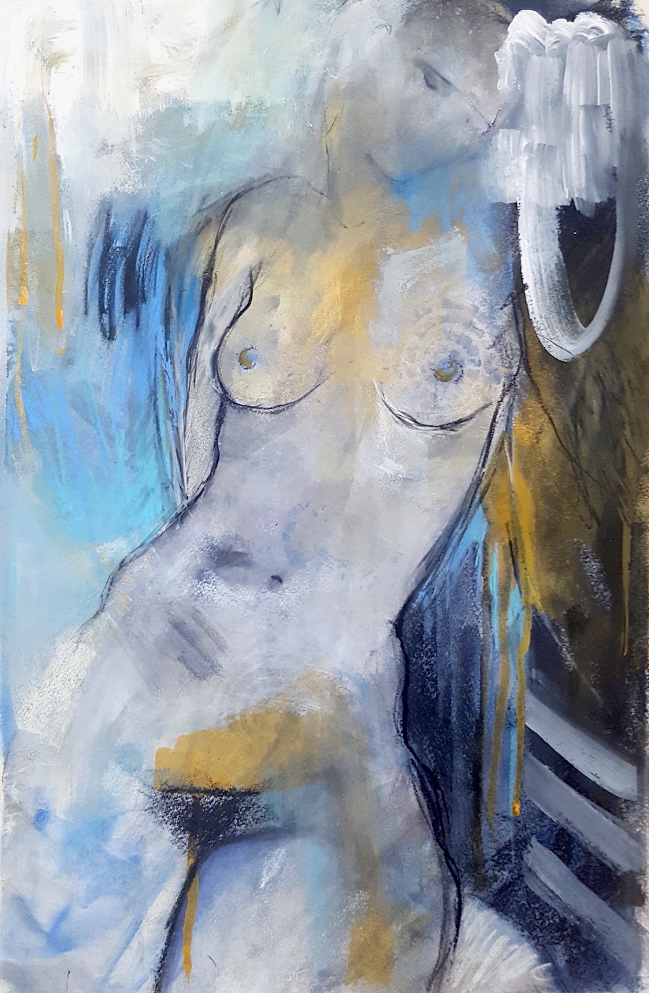
This painting below uses lost and found lines {ie. lines that fade in and out and are of different thicknesses}, smudged ambiguous areas, and ‘unrealistic’ shapes to move the figure into something a little more abstractified.
Try this: Start realistic and keep pushing it, softening or partially overlaying edges, adding glazes and textures and loose marks to rough it up. Lost and found lines, smudged areas, collage cut into shapes, and any ways you can think of to soften edges and loosen everything up can be really helpful in moving away from that kind of literal interpretation and towards a more expressive, free form style.
7. ‘Discover’ the painting
One great – and also challenging – approach is to start fully abstract and pull the painting out of that. You can see how artist Mel McCuddin does that in this video – he brings figures out of his but it works for any intuitive paintings including abstracts. We go into this in more depth in Loosen Up.
Try this: Go crazy and have fun throwing paint down in any colours and configurations you like, then take a step back and turn it a few times to see if there are the beginnings of something you might pull out from it. Work on paper if that helps to psychologically stay unattached to outcomes and avoid preciousness. It’s just an experiment!
This little workshop offers a very simple and meditative way to do this: Calm from Chaos – get access to it inside the Happy Artist Studio!
8. Include a bit of both
You don’t have to abandon realism altogether, and it might be easier to sort of ‘slide’ out of it bit by bit. Plus, contrast is your friend! And not just in values or marks, but in subjects within a single painting too.
Here’s one of my paintings with a ‘bit of both’ {and even that’s pretty loose!}:
Try this: Try allowing a section of your painting to be more realistic or literal, and make the rest abstract. This could mean leaving it looking unfinished, or introducing shapes that don’t ‘make sense’. Your realistic area can be – and likely will naturally be – the focal point, and the abstract shapes or areas can define and support that through the contrast.
9. Use your non dominant hand
This never fails to create looser, quirkier drawn lines with real character. You may not like the naive, slightly awkward look it can create but it’s worth trying it just for the feel of relinquishing some control and seeing what comes of it.
Try this: At the point where you’d normally draw in your subject – whether that’s right at the start or after you have some colours down – draw your subject with your non dominant hand and at a decent speed, and resist the temptation to erase and redraw any of it or neaten it up. {Depending on where you’re at with the transition to abstract this might feel quite excruciating! Try it anyway!}
10. Use texture
Texture is a great friend to abstract art. In the absence of recognisable imagery, you can amp up other aspects.
For example, you can use texture paste or actual sand mixed into the paint to suggest something {like a beach} without actually ‘describing’ it, or simply as an end in itself. It can also be created with different kinds of tools, or by dry brushing.
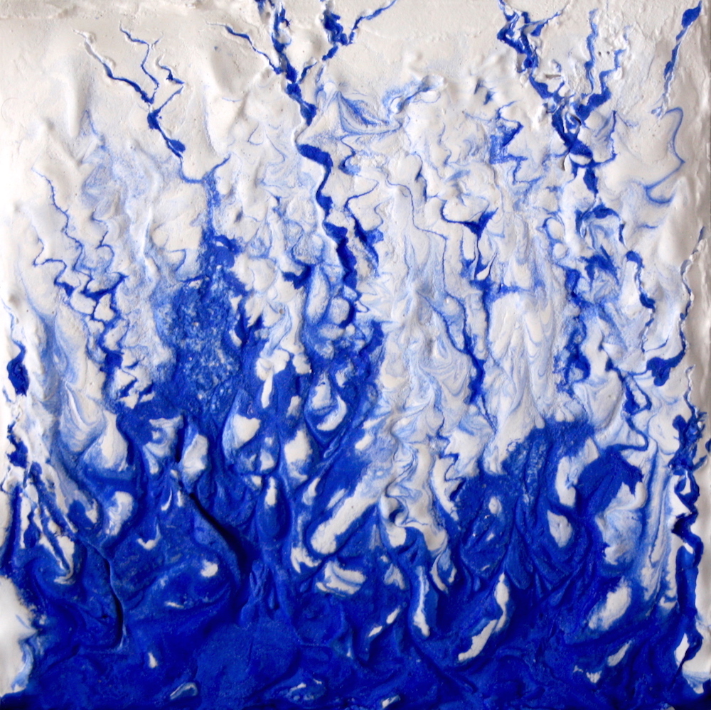
Here’s an experimental textured painting I made using plaster and blue acrylic. I created a cardboard ‘frame’ to sit around a wood panel, poured the plaster in, and when it had started to set, added the blue, then drew lines out from it with a toothpick. The inspiration was the rivulets in sand when the tide goes out, as well as the view of river tributaries from the sky.
Try this: Create a painting that focuses on texture, varying rough with smooth. You could use stencils with some kind of texture paste or a thick layer of gesso, or a palette knife or sandpaper to rough up the paint.
11. Cultivate loss of control and happy accidents
The best way I know of to do this is to work wet into wet. I often paint a canvas or piece of paper with water before going in with the paint or acrylic inks. It immediately removes your controlling input, and creates beautiful soft layers. Marlene Dumas does this to fascinating effect, something we go into in more depth in Loosen Up and Artist Inspired II.
Try this: Use a spray bottle or wet brush to add water in random places on your paper or canvas. Then start adding colour and see what happens. So easy and really fun. If you let each layer dry or use a hair dryer, you can see how it helps build translucent layers.
12. Disrupt
An extension of including ‘a bit of both’ as in number 8, disrupting can be scary to do but can yield fascinating and exciting results that you never could have done if you were using your brain!
These two paintings below, originally one, came about this way; I would never have thought of the pink swipe, or been able to create that kind of unpredictable mark by trying. And cutting the one painting in half to make these two disrupted it again of course.
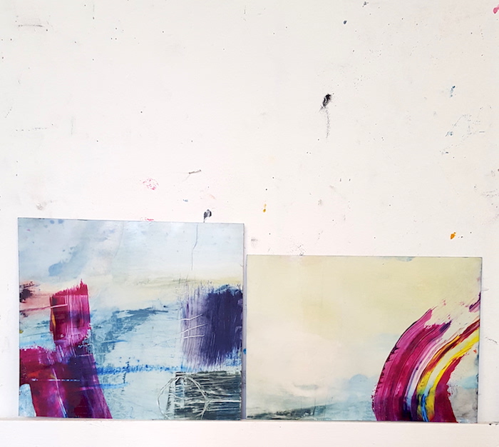
Try this: One way to do this is to take a big brush in your non dominant hand, dip it in one or two colours – perhaps colours that you haven’t used already or have more of on your palette – turn your back {or close your eyes} and make a couple of swipes. For double disrupt points, cut your painting in half. 😉
13. Mostly, some, and a bit
This idea comes from The Simple Secret to Better Painting by Greg Albert. The idea is that in any painting, if you use mostly one colour, some of another, and just a bit of another, you can create a painting that works. It also works for the characteristics of colours, so you could use mostly warm tones, some neutral/warm, and a bit of cool for contrast.
Try this: Choose three colours in varying quantities so that you have one main colour, less of the second, and just a bit of the third. It may take some trial and error, and I recommend getting Greg Albert’s book to really clarify how to do it, but tricks like this can really transform your understanding and the quality of your work.
For bonus points you could start looking at paintings to see how and where the artists have used this formula.
14. Mess with your reference image
When I use a reference image, I always think about how I can change what’s there to make it stronger and more my own. What can I remove from the scene, shift slightly, enlarge, or make smaller to strengthen the composition and start to make it more abstract? And I always change the colours.
If you find it hard to shift into non local colour at this point {ie. colour that is nothing to do with the colours of the original subject}, you can use apps to experiment. Below are some very quick adjustments I made to a simple photo using A Color Story and the Diana app, which combines two photos to create interesting layered images.
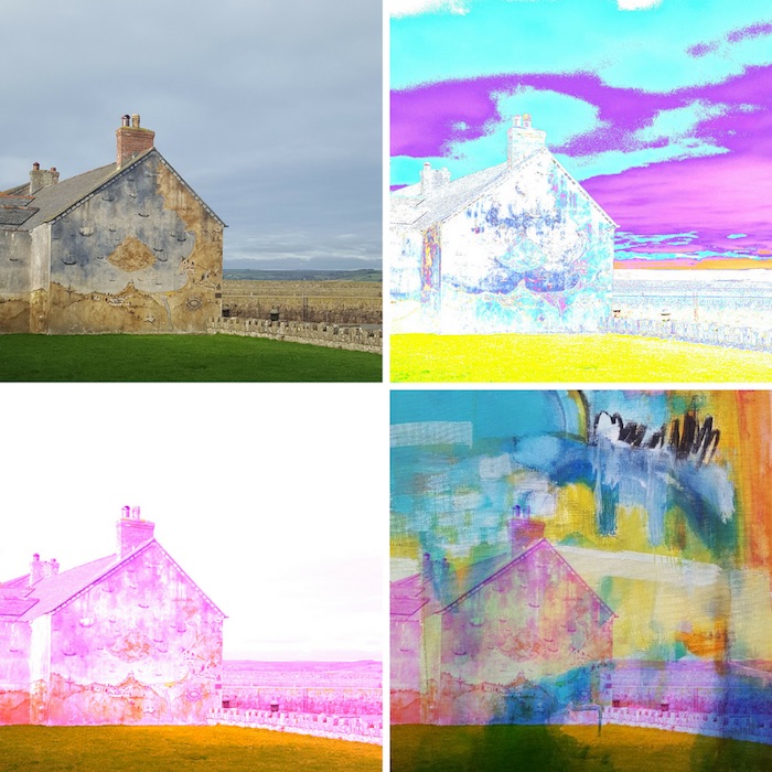
Clockwise from top left: original image | adjusted by manipulating the ‘curves’ element in A Color Story app | using ‘hue shift’ in A Color Story | layering the third image with one of my paintings in Diana Photo
Try this: Choose an image that sparks something for you – perhaps one with a strong composition you could borrow, or a very clear focal point around which you can develop a painting.
Use an app like Snapseed {iPhone | Android} or A Color Story to play around with things like contrast, saturation and colours, to get a feel for how you could translate even something quite ordinary into a vibrant and interesting abstractified painting.
15. Restrict your colour palette
Reducing the amount of colours you use can be good practice in learning how values work and make for bold and punchy paintings while keeping things relatively simple.
For example, you could just use blues with varying values, such as Paynes Gray for your dark, Ultramarine for your midtone, and add white to one or both for your lightest values. Or you could use three different colours – just make sure they are sufficiently varied in value, such as Van Dyke Brown, Cadmium Red, and Lemon Yellow.
Try this: Pick three colours, a dark, a mid tone and a light {squint to help you discern}. Use the dark for your focal point, and the mid and light everywhere else. Use a tiny bit of the light to create a highlight in the dark area, or right next to it, to help it pop. You could refer to the ‘mostly, some and a bit’ concept from number 13 to make this even more effective.
16. Slow fade
For creating a clear focal point and keeping things simple and minimal, let the edges of the painting fade out to black or white or whatever colour fits your painting. Or simply colour block out everything but the subject, as I did in this painting:
Try this: Once you’ve reached a point quite far along in your painting – when you have a focal point and various other bits and bobs going on – choose a colour from the palette you’re using and start softening out the edges around the focal point. See how much you dare to blend away!
Several of you have asked for a PDF of these points to keep in your art space, and lo! I have created one for you! Click the button below to download your free copy.
This list is by no means exhaustive, but there’s plenty here to explore and test for yourself! Do you have any favourite ways to move away from realism and towards abstraction? Share in the comments!



AWESOME ideas, Tara! Thankyou!! I want to try them all! 🙂
Yay! Go for it!
I’ve always been too controlled n not free enough when trying to paint abstract partly due to my previous training in realistic paintings n also my personality to focus on details. Would love to break free n paint with my soul. Thank you for the great tips!
Glad you found something useful here Ping!
This is a really informative, stimulating post providing me with lots of different techniques to try out. Thank you so much for sharing these enriching ideas.
So glad you found it helpful Cath!
Spot on again, Tara. I’m itching to explore abstract expression-especially seeing all the amazing abstract artwork in the #21daysinmyartworldchallenge. Your pointers are exactly what I need to take the plunge. I’m a watercolorist so I’ll let you know how these strategies translate in that medium, Thanks again for all you to do inspire and connect us.
Oh yes, would be interesting to know how they work in watercolour! Hope it helps!
Tara, I seriously think you are a mind reader! Just as I am about to post my current challenge in your #21daysinmyartworld you give me the answers I am looking for! Wonderful. This one is getting printed!!! Thank you!
Excellent! I should’ve made a printable. 🙂
Thanks Tara. These suggestions really resonate with where I am currently at with my painting. Keen to march straight out to my art shed and get started. Cheers
So glad it’s inspiring you to get painting Cindy!
It is interesting to me that when I was in college as an art major, realistic painting was a no-no and everyone was teaching abstract. I have to say, it still does not appeal to me, but I understand the idea of building the best composition and finding the “right” colors (which may be no colors at all if you are going to try and capture texture). In any case, composition is the key to holding everything together.
Interesting about art college! I’m quite surprised actually. And agreed – composition is so key.
So grateful for these wonderful tips and ideas.
Most welcome Brigitte!
I love this Tara. I am trying to download it to my tablet but no luck. Maybe you could do it as a pdf sometime? ??
Quite a few people have requested that so will see about creating one!
Hi Jill – just in case you hadn’t seen, there’s now a PDF to download at the bottom of the post. 🙂
Got it, thanks Tara.
Love the experimentation, playing out in these suggestions. Sounds like a fun way to spend some creative time. 🙂
I’m a massive fan of the ‘E’ word! And if it’s not fun {at least most of the time}, why are we doing it? 🙂
This is fabulous! Thanks so much for taking the time to share so many wonderful ideas. I will be painting for many hours trying these. You rock!
Yay! So glad you found something helpful here Kim!
Thank you Tara for your words of wisdom! You’re very generous. Have seen you around and admired your work for quite a while and now I’m following you….not in a creepy way obviously!!
Haha, thank you! I know it always feels a bit weird telling someone you follow them. 😉
This has given me some great ideas for my kitchen and living room. I’m a little nervous about how to décor my whole room but I think this guide will help me a lot once I start with the work.
I go to a painting hobby centre where we are being taught making abstract/semi abstract paintings. I find your tips very helpful.thankyou
So pleased it’s helpful to you Shubhada!
Hi Tara. I just happily accidentally came across you while posting on my Pinterest. Your abstracts are awesome and your helpful tips will come in handy for me. I signed up for your newsletter as well. Looking forward to the future !!!
Denise
Yay! Welcome Denise. 🙂 Thank you for the kind words!
AWESOME ideas, Tara! Thank you!! I want to try them all! 🙂
Yay! Hope it helps!
I teach watercolor, and was researching for a new class in Creating Abstracts…all your suggestions and ideas are excellent, Tara, and I can’t wait to try them with my students! And introduce them to your site, of course. Many, many thanks for posting this!
Oh that’s fantastic Joan – so glad it was helpful to you! All the best with your new class!
woow I can not believe how useful and extraordinary this tips are! thanks you so much for motivating!!!!
So glad you found it helpful Maria!
Thank you for sharing your ideas! I love putting texture to my work. This is helpful!
I didn’t realize that good paintings are constantly edited throughout the painting process. My daughter wants to get better at painting this year. Maybe she should find a painting class so that she can learn how to edit a piece of artwork.
Oh yes! I’m not sure a painting is ever completed with no editing, although artists will use it to different degrees. Some lessons can be invaluable in learning how to navigate making a painting for sure.
This article has cleared lots of doubts as i am starting as Abstract student, but sometimes it turns very difficult in special if you are a perfectionist! Thanks for your time!
Glad you found it helpful Petrin!
Tara, thank you. I think I can now begin to learn the art of abstract painting. I have thought of a number of ideas, but lack the ability to put them to canvas.
Great tips. Thank you so much for taking the time to create this. I’ll be experimenting with all of it 🙂
Glad it was helpful! Happy experimenting. 🙂
Thanks, Tara I’m new at painting and I love all the things you had to say, it gave me something to start with. I hope to use some of these ideas when I do my first abstract painting if so will take picture of it and send it to you.
So glad you found it helpful Ed!
Nice. I have seen it before but can use it now.
Interested in redirecting my painting process
Nice tips for when creating abstract art Tara. I am into texture and building layers, and yes adding and removing paint repeatedly on top of texture is a really fun way to create a unique depth and richness. It also allows for incidental colors to take form which can create that bit of needed magic in the creative process.
So glad you enjoyed the post Jaison! Love your description of creating magic through that adding and removing process too.
Thank you for sharing some much needed information to a 72 yr. old painter! My teachers were not able to explain how to switch paintings from realism to abstract. I can not thank you enough. Each suggestion you made stirred up an idea of ways to “upcycle” some of my older paintings and paint others.
That’s wonderful Teresa, I’m so pleased it was helpful! It can be quite challenging making that shift, as it’s partly mindset and habits, and partly the practicalities of HOW. I’m glad you found some ideas to get you started here.
Is there any separation between art and expression? I say there is, but I’m not sure where the line of demarcation exists. Perhaps it is strictly in the eye of the beholder?
I think that’s probably one of the endlessly pondered philosophical questions of art! For me personally, art IS a form of {self} expression, and that’s its main purpose in terms of what and how I teach. But of course there are infinite other ways to think about art and expression. I think that’s one of the beautiful things about art too – we get to decide for ourselves what it means!