You might know that I don’t like to get too technical about painting and drawing.
For me it’s primarily about revealing and developing yourself through your art, so that what you bring into the world is a true expression of you.
However, without some level of understanding of the basics, it is much harder to create paintings that ‘work’.
Personal fulfilment and satisfaction is paramount, but some of that comes from making art that ‘makes sense’ to both left and right brain.
Generally speaking I think a lot of the time we know a great deal of the theory instinctively.
I believe we all know what feels good and balanced and what doesn’t, even if we don’t or can’t put words to it.
And when we paint we’re automatically tapping into that part of ourselves that naturally leans towards this balance.
However, instinct may not teach us everything, and filling in the gaps in our knowledge and understanding about the theory side of things can still seem like a bit of a chore. {Or maybe that’s just me?!}
But you can still get a good grounding in the basics in a way that doesn’t feel stressful and like you’ll ‘never get it’ or know how to use it.
With that in mind, today I’m going to look at three ways to create interesting compositions. Easy to understand and implement, no degree required!
{Which is fortunate, as I don’t have one.}
There are quite a few ways to create a pleasing and balanced composition, so I’ve picked just three of my favourites to share with you today.
strata
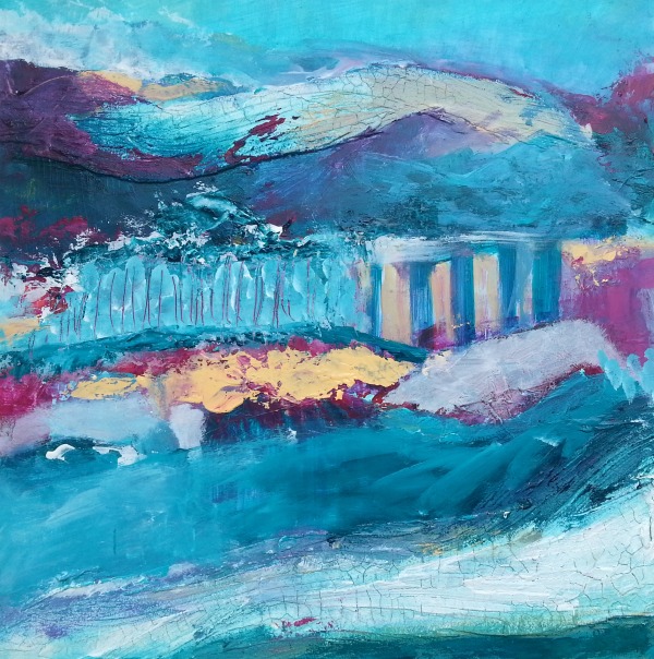
Simply meaning layers, this type of composition lends itself well to both stylised or uniform patterns and a more blended, expressive approach, as you can see below in my painting ‘Escape’.
It can also operate on a more metaphorical level, giving a sense of layers of meaning or the layered nature of human psychology, for example.
Full disclosure: I actually learned about strata as a specific composition after creating this painting, proving my point about our natural tendencies to create harmony in our work.
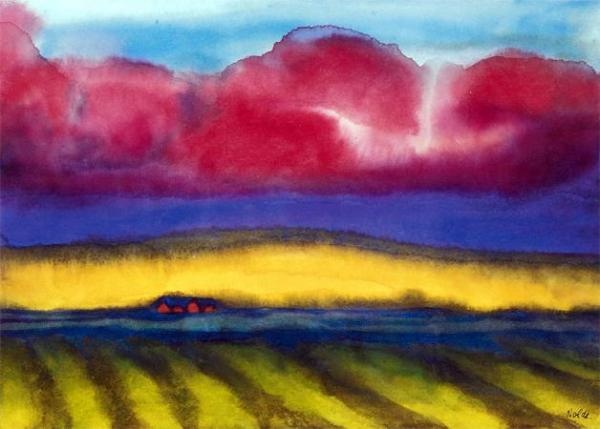
Here’s a painting by Emil Nolde {Marsh with Farm} that demonstrates the strata composition:
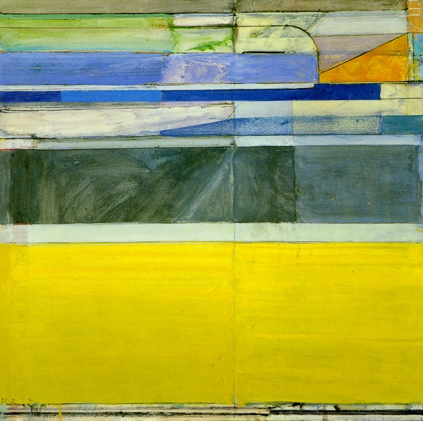
Richard Diebenkorn’s ‘Ocean Park No 117’ uses strata in a much more defined way:
s or z shape, or tunnel
This one is very effective and fun to use!
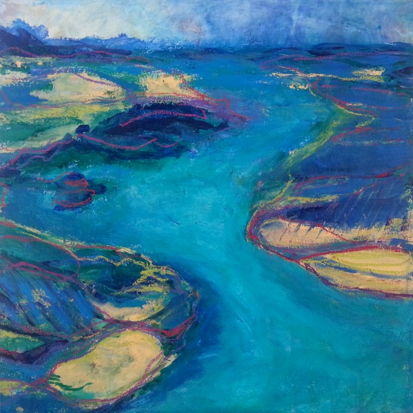
As the name suggests, it calls for creating a straight path, or a curved or rigid zig zag that leads the eye into the distance, giving an impression of depth.
It’s great for landscapes, although not limited to them.
Here’s my painting, ‘River’, that demonstrates this composition in effect. You can see I took a step or two over the boundary of landscape into ‘abstractifying’ it.
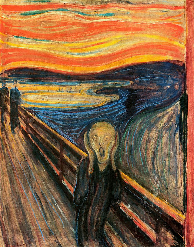
‘The Scream’, by Edvard Munch, shows both the tunnel and the s shape, and even a bit of strata, if you ask me. 😉
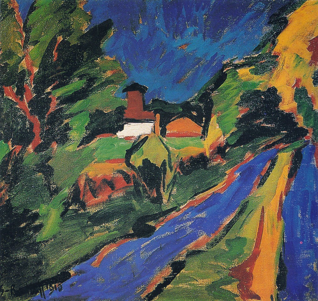
Here’s a painting by Karl Schmidt-Rottluff, ‘Dangast Landscape‘, which demonstrates the tunnel composition {essentially a triangle that points into the distance – you can have some fun playing with placement, size and angle}:
rule of thirds
Simply put, by mentally {or literally, if that helps} dividing up your canvas into nine equal sections, and placing your focal point where the lines cross over each other, it will create an image that complies with the rule of thirds.
The fact that it’s called a ‘rule’ need not put you off – it’s more of a guideline than a strict rule, and can definitely be played with.
Generally speaking that will mean that your focal point is off centre, and the eye finds this harmonious to look at, so it’s an easy way to make a painting work without too much effort.
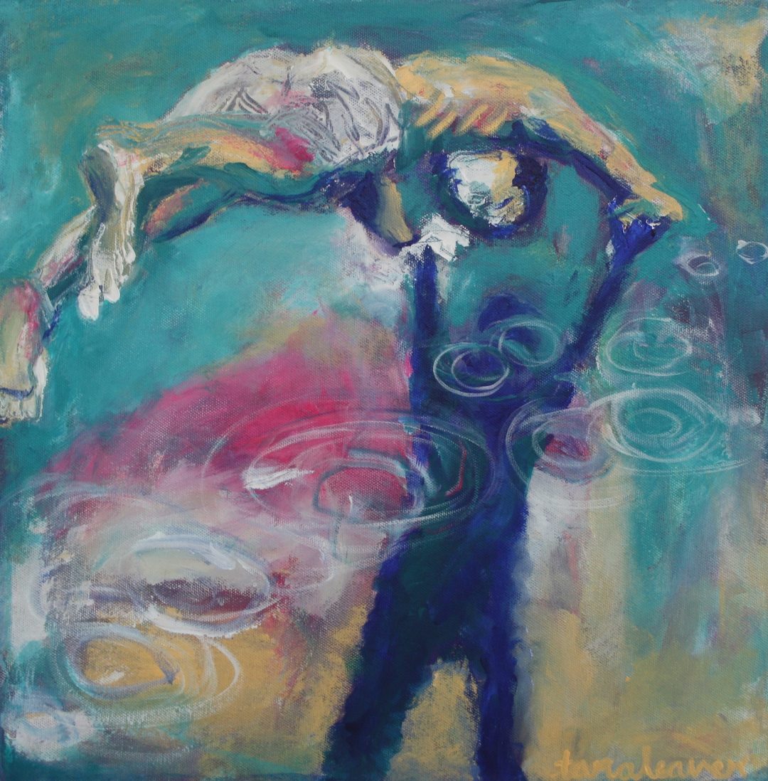
My painting, ‘The Diver’, roughly uses the rule of thirds, and again, I did not consider this consciously before doing it!
If you put an imaginary grid over the painting, the boy lines up roughly with the top horizontal line, and his shadow also roughly with the right vertical.
{There tends to be some dispute as to whether the rule of thirds is the same thing as the Golden Section, but in the interests of keeping things simple and focusing on ‘fun and easy’ over ‘controversial and potential minefield’, we’ll just stick to one today!}
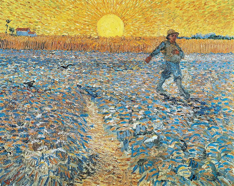
Another example of a painting using the rule of thirds is Van Gogh’s ‘The Sower’: The figure sits where the top horizontal and the right hand vertical lines would cross, and the wheat stalks run along the top horizontal.
We also have a bit of the tunnel in action with that triangular path pointing up towards the horizon.
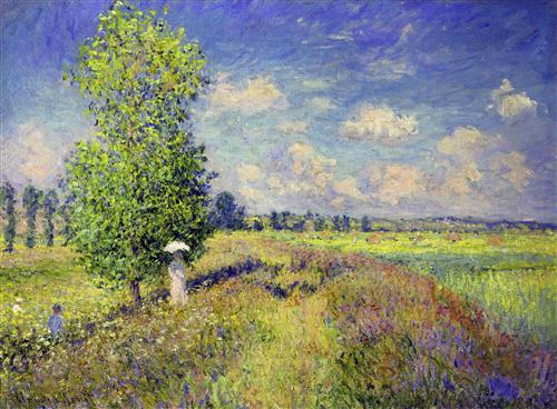
And here’s Monet’s ‘The Summer, Poppy Field’: Notice how the tree sits where the left hand vertical would be.
{There’s also some use of the tunnel composition here, with the pathways of flowers that point into the distance.}
Do you have a favourite composition? Take a look at your past work and see what composition you most use, even if you’re not necessarily aware of it!
*******
 Need more help with your art development?
In the Happy Artist Studio we focus on both process and mindset – what I think of as the two pillars of a happy artist life.
So you get courses for getting your hands painty and refining your artist voice, and lots of support and guidance in making sure you’re supporting yourself as you grow. Because demons are a thing and they hold too many artists back! Self doubt, fear, imposter syndrome – none of that needs to be a problem.
Come and join the Happy Artist Studio and start creating your happy artist life!

Can’t wait for class to start!! Thanks for all the tidbits……looks so good!
I have used all three, or variations on them anyway. I also am looking forward to learning to Abstractify!
Yes I think we all use several of them, even unknowingly. Looking forward to having you in the group Andy!
Hey Tara, great post!
I’ve just taken a look at my work and noticed that I use ‘threes’ a lot, so I tend to have three images that I place on the canvas in a balanced way.
I also often place things off center, or if I have something top right I’ll balance it with something bottom left.
You’ve got me thinking now!
Great observation Madalaine! You’re obviously naturally placing things in a way that the eye and brain find pleasing – am so glad the post got you thinking!
Loved this! Will definitely use the grid – I kind of do that intuitively, but I’m glad to hear your explanation!
Hi Tara, I don’t know if I’ll ever get ‘composition’. I paint figures with watercolors on 5×8 sketch pads and it just looks like a figure plastered on the page….my work just lacks any kind of composition and this has bothered me for a long time. I’m enjoying your free course online. I don’t seem to have an intuitive feeling for design. Can I learn it? I did an abstract watercolor recently and its lack of design makes me feel uncomfortable. Sorry I seem so negative, but this has been a problem forever for me. If anyone can help me, it’s you. Your sense of color and design is amazing.
Thank you that was very interesting
Tara, when I was sorting through some things the other day I found that list 24 ways to loosen up your art. A reminder list. Somebody had printed it off for me and I see that it also goes by “24 ways to let go and express yourself freely”.I tried to share this with the creative fire group in one of the comments. However, I didn’t have the title right nor did I know it was from September 15, 2014.!
I really enjoyed reviewing that information and your current more personal note Artnote, June, 2018, as well as reviewing the information on composition.
I think it’s really exciting that you’re doing the year of study with a mentor. Sally.
This looks like great teaching. Please include me
Virellekidder@gmail.com
Visit http://www.taraleaver.com/abstractify and you can sign up there Virelle! 🙂