Sometimes you’ve done everything you know to do, a bunch of stuff you totally just made up on the spot, you’ve slept on it, asked for advice, you’ve turned it every which way, knocked it back and redone stuff, and still that damn painting doesn’t seem to be quite right.
And you’re buggered if you know why.
If you’ve never experienced what I just described, have a gold star and go and play – there’s nothing for you to learn here. 😉 Oh, and please share your secret in the comments!
In my experience there are three main reasons this could be happening. {Tons of minor ones too but it’s likely one or more of the following may be involved.}
One | You haven’t pushed it far enough
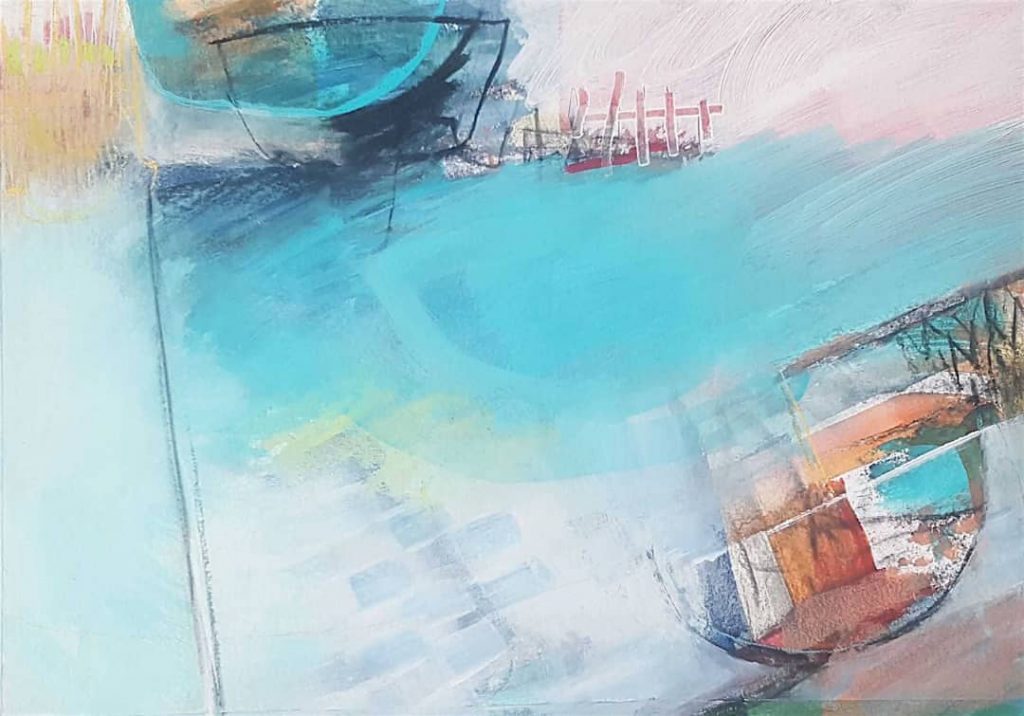
I talked about this here, when we looked at Sharon Bruster’s painting as it developed. Below is an example of my own work, where I could have stopped and called it done, {and really wanted to!}. But it didn’t feel at all right to me – it wasn’t expressing what I wanted to say – so I decided to embrace the Bold Move and kept going.
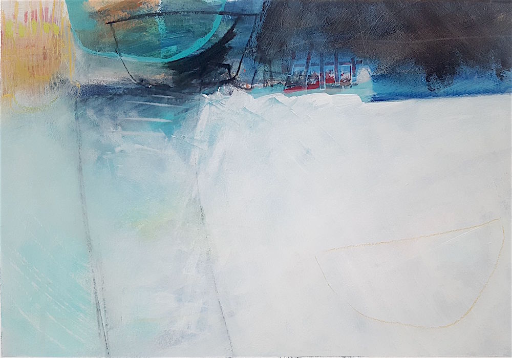
And below is how it is now. I like it a lot more and am happy to call it finished. And yes, there are those who have disagreed with me! The point is to trust yourself and what feels right to you. There will always be those who see it differently, and that’s ok.
It can take a while to learn to discern {and then to stop ignoring!} that feeling that says, this isn’t finished. But the more you paint, the more out of integrity it starts to feel to call it quits when you know deep down you could take this one further and make it richer and more nuanced.
At this point, for me, there’s a specific feeling of discomfort that comes with being out of integrity with a painting. It will nag at me until I feel it’s satisfactorily resolved. It’s a useful – if somewhat irritating! – gauge, and enables me to be brave enough to push a painting far beyond what I thought was possible, or indeed what I was capable of. And even then I could always go further.
Two | Not enough contrast
This one can be tricky, because some paintings are all about softness and subtle, closely related values, or similar/repetitive marks. {Although there can still be contrast within these narrower parameters.}
However, as a rule of thumb it’s a good idea to include some obvious contrasts, at least while you’re getting to grips with how it works.
Here are some examples of contrast in a painting – it doesn’t have to be to do with values:
- light/dark
- soft edges/hard lines
- busy areas/quiet areas
- ugly/beautiful
- ‘fast’ spontaneous marks/’slower’, more considered marks
- large shapes/small shapes
- thin lines/thick lines
- wild gesture/neat areas
Here’s a painting I don’t feel is fully resolved yet in terms of contrasts. Since I also haven’t decided why {although I have some ideas!}, I’ll leave that bit of sleuthing to you. There’s no real ‘right answer’ – one person might see this as finished, another may see it as an underpainting.
Not sure how to see the contrasts clearly? Here are three ways to make it easier:
1. Squint! Or stand waaaaay back from your painting {perhaps also turn it upside down} and notice what jumps out right away. That’s your highest contrasting area{s}. Now, are they helping to lead the eye around the painting? If not, could you put in some smaller/larger areas of contrast to make it work better? Does it need a different kind of contrast brought in? For example, if you have a good range of values, are your shapes all a similar size, or do your marks need to be more varied, or moving in different directions?
2. Photograph your painting and desaturate it using an editing app {or the one in your phone} to make your painting black and white. Immediately your contrasts, in particular the values, will become clearer.
3. Look at your art through a piece of red acetate {available on Amazon}. I haven’t tried this myself – I generally use the first method – but am reliably informed that it works.
Three | No focal point
The eye wants to travel, and it also wants to rest. {It’s pretty demanding, the eye!} A very frenetic painting can feel exhausting to look at, and a super minimal one can feel a little flat. Having a focal point – a main subject – in your painting, and then using your mad skillz to lead the eye towards it and around the canvas meets all the eye’s needs and makes looking at the art a satisfying experience.
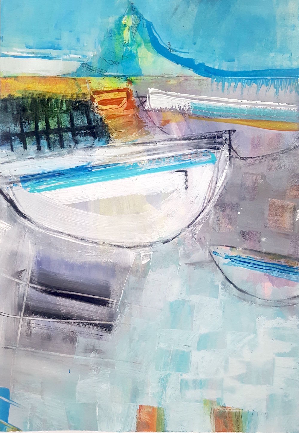
Here’s a painting of mine I’m not entirely convinced by. {I was, but have since changed my mind. We can do that – we’re artists. 😉 }
It feels like there are two possible focal points – the mount at the top and the massive white boat – and we don’t know which to look at! I should really do something about this.
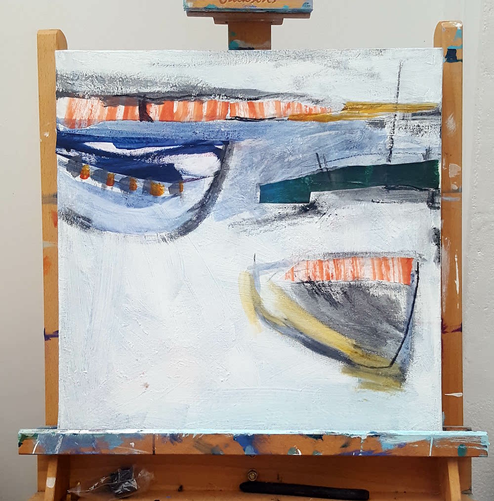
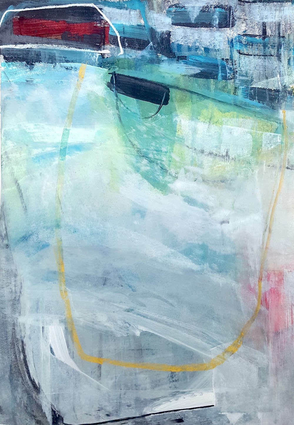
And here’s one that I feel is successful:
The focal point is in the top left, and the looping yellow line helps the eye to travel across the whole canvas. There’s enough interest at the bottom to bounce off and back up towards the top, and while most of the action is happening at the top, there are some subtleties elsewhere that engage the eye without exhausting it.
Where do you tend to get stuck with your paintings? Is there something here that gives you a little spark or nudge as to how to move a current sticky one forward? If you have any questions, let me know in the comments and I’ll do my best to help!


Your mailings and happy useful comments on art are a delight for me. I look forward to them all, but get quick fixes from Pins on Pinterest! Looking forward to Touchstone as I hope it will kick stat something after a DRY spell of some 15 years. What happened to me I wonder????
So glad you find useful things here Suzanne! Would love to help you reinvigorate your art practice!
These are great guidelines on trouble shooting why some paintings
just aren’t working, though the finish line is near. Thanks for your amazing content and generous sharing of it.
Thanks! And you’re welcome. 🙂
Hi- I’m not a beginner but not too experienced either.
All that you say makes so much sense yet I’m stuck stuck and can’t seem to get unstuck! It’s awfully demoralizing.
I’m at the point where I’m trying half-heartedly to fix things every day and deep down I know it’s not going to work.
1. it be because I’m working on a larger than my normal canvas size for the first time?
2. Is it normal for artists to just chuck it sometimes?!
Nothing could be worse for my self-confidence.
Very very unhappy ☹️
Thanks
Hi Rafiya, I know it’s very easy for me to say this, but this really is just part of it. It’s part of process, it’s part of being an artist. The up times can be very up, and the down times can be proportionately grim! And there isn’t a point at which that stops happening for good {sorry}, although we can definitely cultivate tools and mindsets that support us in making it less awful when it happens.
In my experience, the big downs are indeed often part of trying something new. Last summer I had some terrible times with my art while I was working out a new-to-me approach. I mean literally sitting on the floor crying. The frustration and fear were intense at times. You’re really not alone in this. It’s sounds so dramatic but that’s because art is part of who we are, so it feels very significant, especially if we’re stuck or things aren’t going well.
There are lots of things you can do in this instance. A key piece, and I know it’s annoying, is to really try to be relentlessly kind to yourself. Beating ourselves up is often the default but it doesn’t help. Ever. Another important thing, from my experience, is support. Whether that’s a mentor or a group, online or off, somewhere you can go for pep talks and feedback, or just to hear ‘I know, me too.’. I also don’t think there’s anything wrong with staying in your comfort zone. Perhaps do a bit of what you know you can do and are good at. The larger canvas will still be there while you slowly build your confidence again; you might even get new ideas for it. Ask others how they approach working larger. Stay open to new things to try, and allow yourself to discard anything you don’t like or isn’t working. Take a little break, or a series of little breaks, or one big one. Listen for intuitive nudges about what’s best for you right now and try not to judge them.
Honestly, being an artist is just like anything else, only maybe more intensely! There are ups and downs. We keep going because it’s who we are. You’ll get through this sticky patch!
This helped me a lot, i’ve been working on a full body painting and something wasn’t quite right with it even tho i checked the proportions over and over, it turns out i needed to push the background a little further to balance out the painting.
Delighted to hear it was helpful!