Ever since SeeFeelPaint I’m still very interested in landscape as a subject, and specifically in taking a landscape as a reference and ‘abstractifying’ it by simplifying shapes and using ‘non local’ colours.
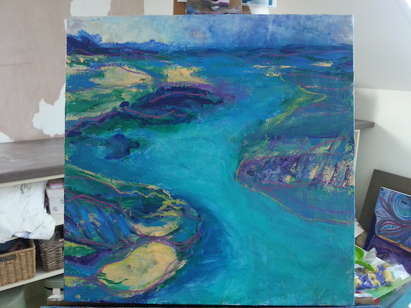
This painting as you can see from the image below was already partly done, and then taken further with the help of an image {a photograph, as opposed to another painting} I found on Pinterest.
The initial layers were done entirely with a palette knife which, although a really fun way to paint, was not giving me the look I wanted, and because I didn’t have a reference, had rather lost its way. But you can see it already had a similar composition to the image.
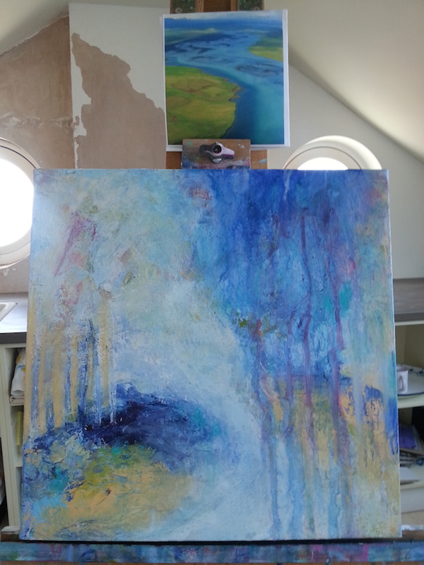
I had the usual trepidation about losing sections of this initial painting that I really loved, but also knew that I’d need to sacrifice them for the whole, and I’ve done it enough times at this point to know that it’s always worth it. Sometimes you just have to be bold.
My first moves were to reestablish the composition so it was stronger {to me}, and to begin to map out some shapes and bring in the colours I wanted to use. The green you see was a mistake, in that I used it and then wished I hadn’t. But it’s fine when working on a painting like this because every layer adds depth and none of it needs to show.
My palette these days tends towards a somewhat predictable {or perhaps just more consistent!} range of blues and turquoises, plus Naples Yellow, sometimes some purple, and often some fluorescent pink.
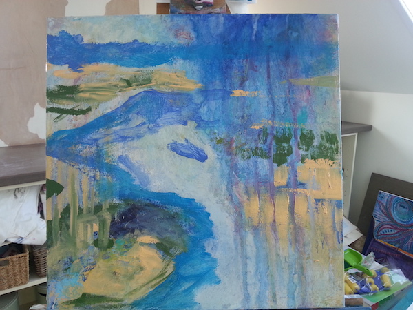
I found the reference image useful for mapping out lights and darks, and then went off on tangents since it wasn’t meant to be a direct copy and because my canvas is square and the original image is a rectangle. I do love a high horizon line; it makes for a really strong composition and somehow makes the canvas feel more spacious.
It sometimes happens that things start to feel a bit flat and samey in terms of colour and tone, which is what happened here, so I dived into my oil pastels and used them to add a different energy with lines.
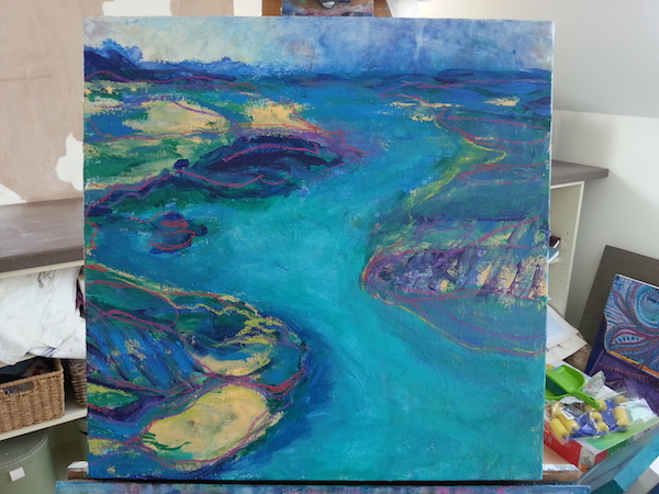
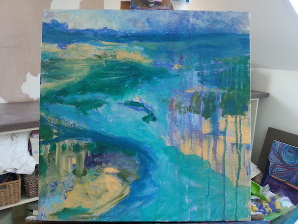
That made all the difference for me – some pops of colour to liven it up and help the eye travel around the canvas. I’m also loving how the horizon looks kind of stormy on the right hand side.
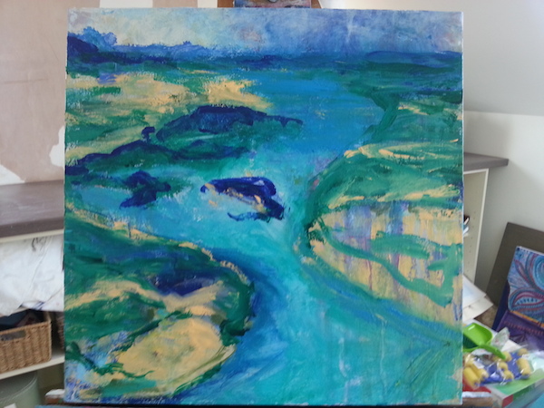
And yet although we can look at this and see a river coming towards us from a mountain range in the distance, we can also enjoy the colours and shapes in a much more abstract way. This is what’s interesting to me – taking something we know and making it new.
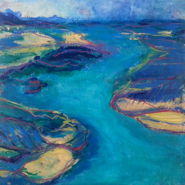
River by Tara Leaver :: mixed media on canvas :: 40 x 40cm
incredible to see the process (I’m not a painter) – some of the in betweens are lovely too as abstract art.
love the fluidity and colours of the finished piece!
Thank you so much Kif! And thank you for stopping by; so glad you enjoyed it. 🙂