So I finished Mr Seahorse. Thank you so much to those of you who offered advice and suggestions; it really helped kick start my creative juices. I turned it upside down, considered adding white, orange and green, and had a little chat with my muse (or Spirit if you prefer) about it.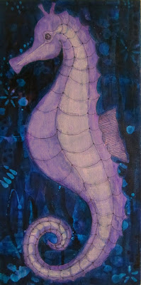 Then I did a glaze of Turquois Phthalo (a deep translucent turquoise) over the entire background and finally I know it’s finished. The background and subject were too similar in colour and tone, but now the seahorse stands out better and my left brain is happy that his surroundings are appropriately sea-coloured.
For some reason I can’t seem to edit the photo to look how it actually looks in real life, but this is as close as I can get!


Looks wonderful, Tara! Sure it will be treasured… 🙂
Love it Tara!!
He looks lovely x
It's a real beauty.
He's perfect. Wonder why I think of him as a 'he'. His colour stands out much more now and is gorgeous!
x
This looks great!
I love how having the background evened out really makes the seahorse stand out.
He's wonderful! I love how the glaze of color on the background really makes him pop out. I'm going to learn so much about painting by reading your blog! 🙂