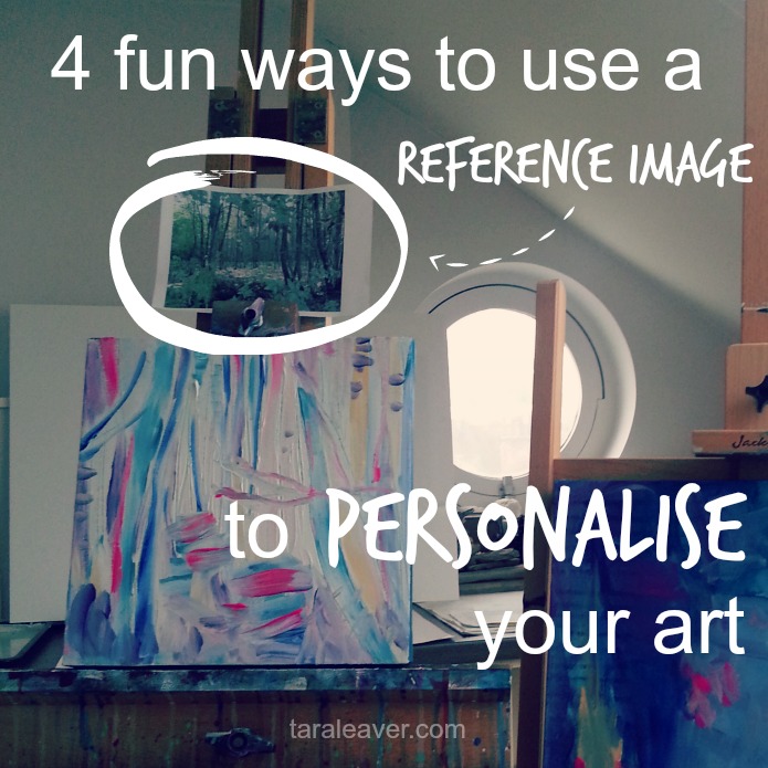
I use reference images a lot when I’m painting.
Because I prefer my paintings to have a basis in reality {however tenuous!} rather than be full abstract, I like to have a tangible starting point.
I might deviate from it until it’s unrecognisable, but for me, it’s one of my favourite ‘ways in’ to starting a painting.
Let’s get the issue of copying out of the way first of all.
I don’t generally use or necessarily recommend using reference images to directly copy, particularly if you’re focused on exploring your own unique artistic style, and here’s why:
- I find it limiting; one of your gifts as an artist is that you can go beyond what the eye can see
- If it’s not your own photo there are potential copyright issues
- It’s much more fun to use it as a springboard to make something only you could make
- An image can be combined with others to create something completely new and exciting
- You might only like one particular aspect of the image
- It’s not necessary if realism is not something you’re personally interested in exploring
- Even if it was, for me it’s also not where I’m strongest or where I find the most excitement and satisfaction, and since I make art primarily for my own pleasure and discovery, I’m going where the excitement and satisfaction are!
Obviously copying/realism has its place and is how many artists work. This isn’t about dissing copying.
But when your focus is uncovering your own unique way of creating expressive art, I believe that letting go of copying creates the space to really develop that.
So here are the main ways I like to use reference images as doorways into creating paintings. Perhaps they will give you some ideas!
colour palette inspiration
You only need to spend five minutes on Pinterest to discover how many incredible, vibrant, exciting colour combinations are possible.
And it can often be the case that you’re drawn to the colours but not so much to the image itself.
One way to use your reference then is to just borrow the palette!
There are plenty of sites that can help you compile a cohesive colour palette digitally from a photograph {like this one}, and this can then be used to create your own version in paint. Or just do it by eye!
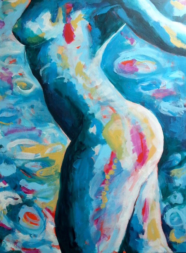
This painting of mine came from a desire to use a much softer, paler palette than my usual brights.
{In this case, although there was a reference image, the colours were inspired by looking at softer art palettes used by other artists.}
Lavender
mark making
In the context of reference images, this one tends to apply most to using the work of other artists as your inspiration.
{Obviously I’m not suggesting copying another artist’s work or personal style in its entirety.}
I’m talking about really looking at the way they make marks. I’ll ask myself questions about what I’m seeing:
- Are they using different sized brushes, or other tools to make marks?
- What kind of energy do the marks have? How do they enhance the feeling, message or subject of the painting?
- How might I recreate that? How would I need to hold and use the brush to create that energy?
- What is it about these marks that’s exciting to me? Are they going in lots of directions? Are they textured? Are they saying something profound with very little?
Then I’ll take something I’ve discovered and try it out for myself.
This could be a quick test on the nearest piece of scrap paper, or working a new-to-me idea into a larger painting.
This painting was in part an experiment in painting around and over layers to make this dappled ‘tree’ effect; I’d seen several different artists use it and was interested in how it was created and whether I could do it in a way that pleased me.
Turns out I could. 🙂
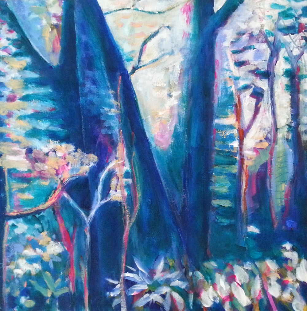
Terra Incognita
composition
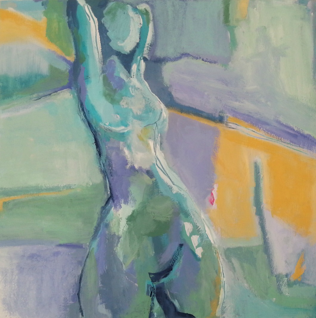
This is one of my favourite ways to use a reference image.
I’ll find images I like, such as life drawing figures {in the absence of the real thing I like the ones from this site} and print them off so I can transfer them to the canvas in my own way.
That might mean folding one so only part of it is revealed, and filling the canvas with that part, which is what I did here:
I’m Ready
You can see I also made use of all my favourite non local colours, distorted the figure a little and added some experimental squashed circles for the background. 🙂
using apps
You might already be using apps to enhance your photographs, but are you using them to do it specifically for your paintings?
I used an app to enhance this photo of myself, which then made it easier to turn it into a painting by simplifying the shapes and tones.
It also helped me ‘step away’ from getting tangled up in trying to paint a portrait, and focus more on transferring the shapes from the image to the canvas.
Here it is from original photo to final painting:
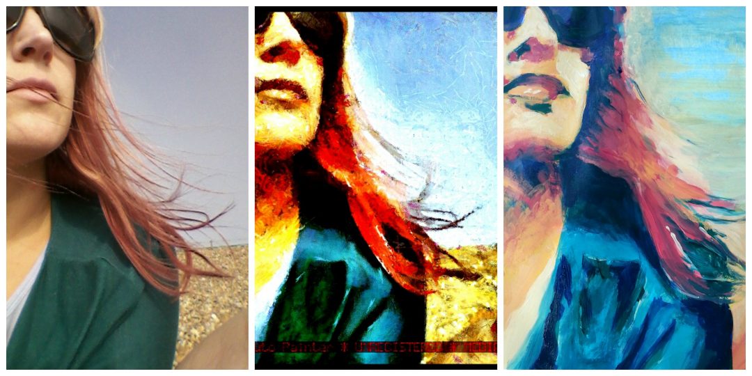
I highly recommend trying this; there are eleventy million apps out there but I like Dynamic Auto Painter on my iPad {for Windows or Mac}, PicTapGo, and Picmonkey on my laptop for super easy enhancing.
What about you? Do you use reference images for your art, or do you prefer to paint more intuitively? If you use references, how do you use them to create art that’s truly your own? Tell us in the comments what works for you!

Love this 🙂 going to have to try it out 🙂
Wonderful Kerri! Have fun – and feel free to share or ask me any questions that come up.
i love this T… so helpful for those who are not sure where to start with a painting. i practice many of these things too – especially the ‘cropping’ something and just painting part of it – usually the part i like most. 😉 In the past year, your art has really blossomed. i love everything. Your colours, composition, subject matter… you are obviously putting your heart into it. xx
Thank you P! And I hope it is helpful. 🙂
And thank you for the kind words about my art – something has definitely shifted for me recently.
I recently purchased Procreate for iPad and am having lots of fun with it. I can create digital art that’s cool in its own right and transfer ideas and images into paintings.
I admire artists who can express themselves digitally – not something I found an affinity with! Great that you can use it this way.