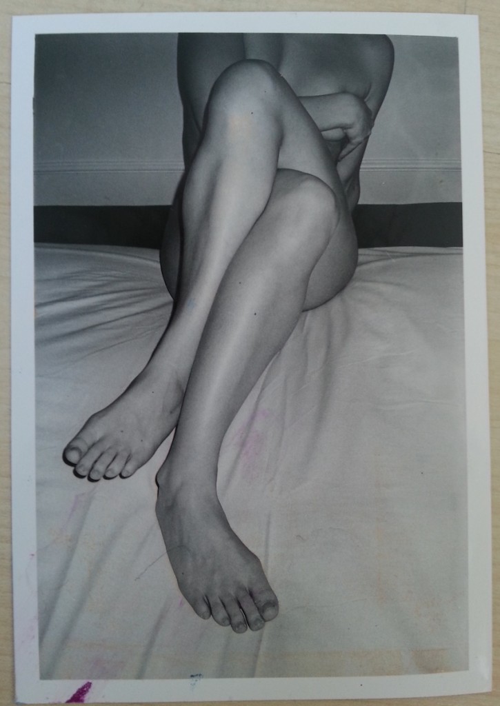
When I was twenty, I got my boyfriend at the time to take photos of me so that I’d have something to work from when I was making figurative art.
This was my favourite:
I forgot about the photos for a really long time. Then, I suppose as a result of moving house or some other clear out, they resurfaced.
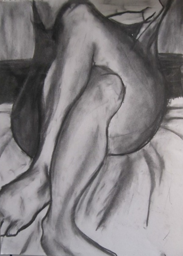
I made a charcoal drawing in 2011…
…and then promptly forgot about them again until a few weeks ago, when I was hunting down figurative art from my own gathered resources.
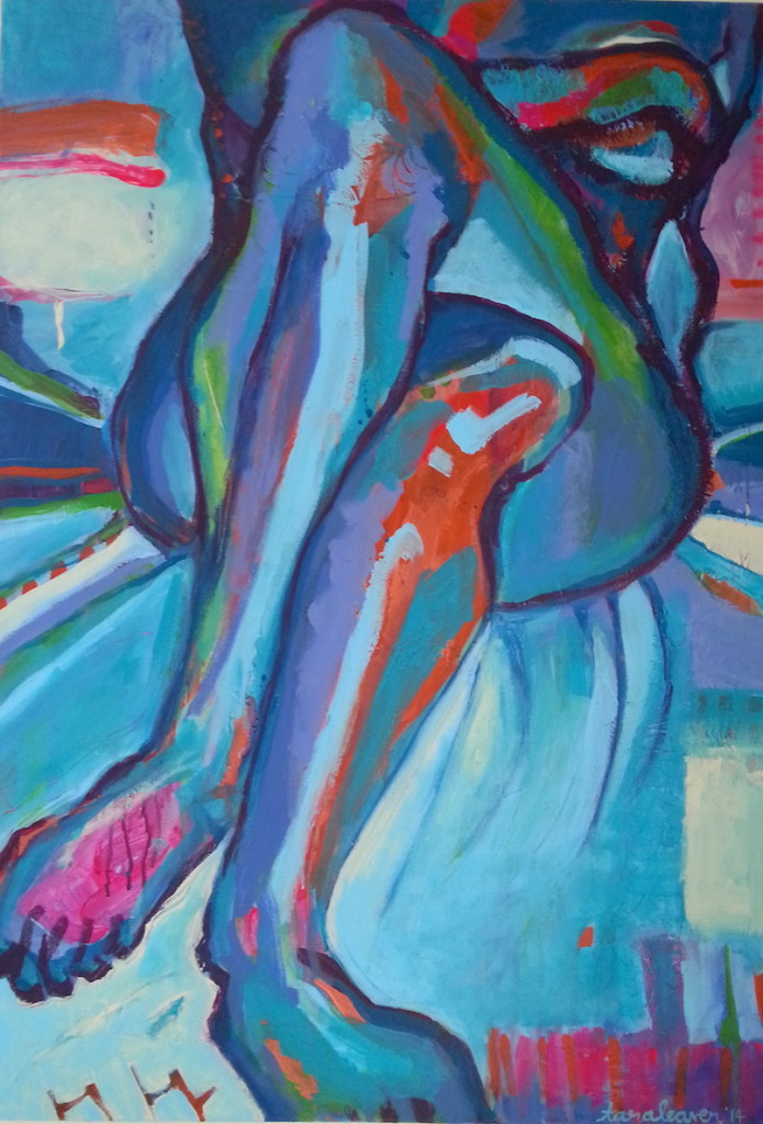
As soon as I found them I knew I wanted to make a large scale painting, something loose and expressive and vibrant.
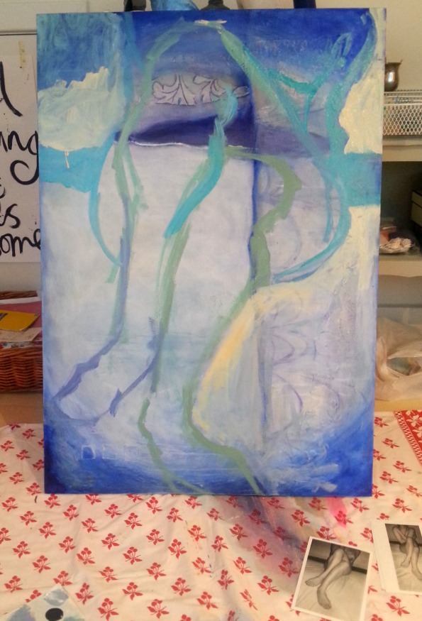
I had the perfect canvas – one that had not worked out at all as I’d wished and was also the perfect size and shape. You can just about see some of it under the first image. {Tilt your head to the left and you’ll see it.}
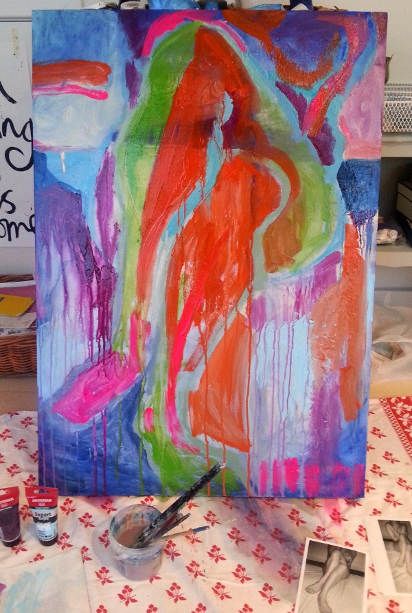
So I went in bold! Big strokes, bright colours, whatever I felt like using in the moment. I really love starting like this because it can be totally wild and even if you hate the colours you can keep refining and refining with each layer. There’s no ‘wrong’ and everything you lay down gives depth to the final outcome.
You can experiment with marks, spray the crap out of it so that it’s dripping everywhere, do things you’d never normally do in the final stages of a painting because they’d feel too risky. {Although as I type this I’m wondering why that is.}
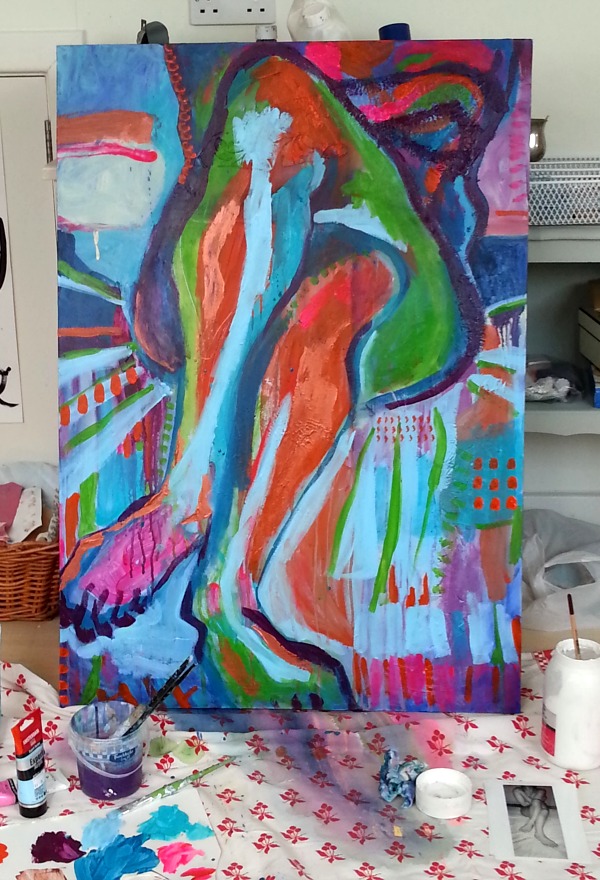
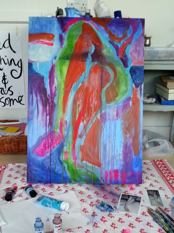
Then I started paying more attention to the reference image, adjust the shapes and putting in the tonal differences. It never even occurred to me until I’d finished that I wasn’t using realistic colours! I didn’t consider the colours at all, except to go straight for what I was in the mood for.
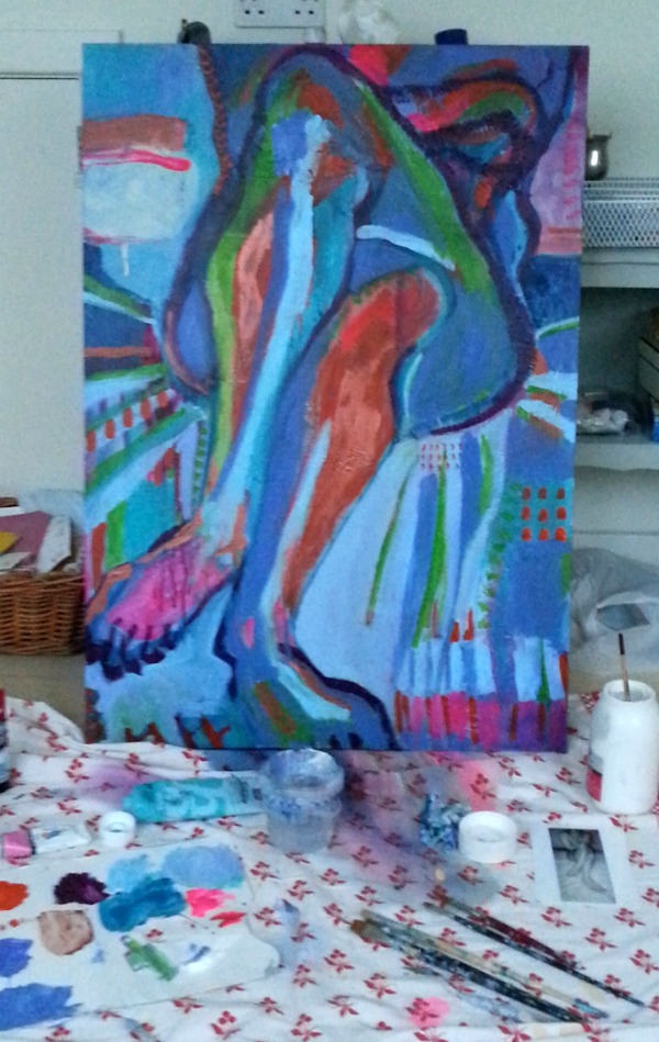
Sorry this one above is a little blurry. Sometimes I’m taking the pictures fast because I’m in the flow of painting. You can see I’m starting to calm it down with the light blue at this point. I wanted it to have some quiet areas for the eye to rest, but to mostly be a kind of visual smack in the face. 🙂

Love this Tara! your charcoal drawing is great. Really interesting to see how you began translating the photo and the intuititve approach you took around colour. The end result is lovely, and the colours really do give it a quiet vibrancy.
Thank you for the lovely compliments Debbi!