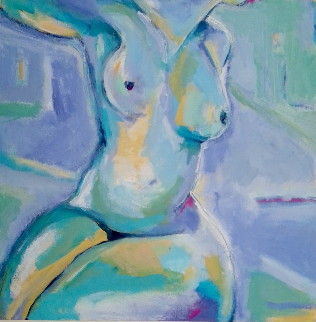
Remember Lavender? She now has a sister, Violet. Whether it will become the full triptych I don’t know yet, but these two look so good together. Plus I’m absolutely revelling in my love of figurative art and a colour combination I’m pretty much obsessed with right now.
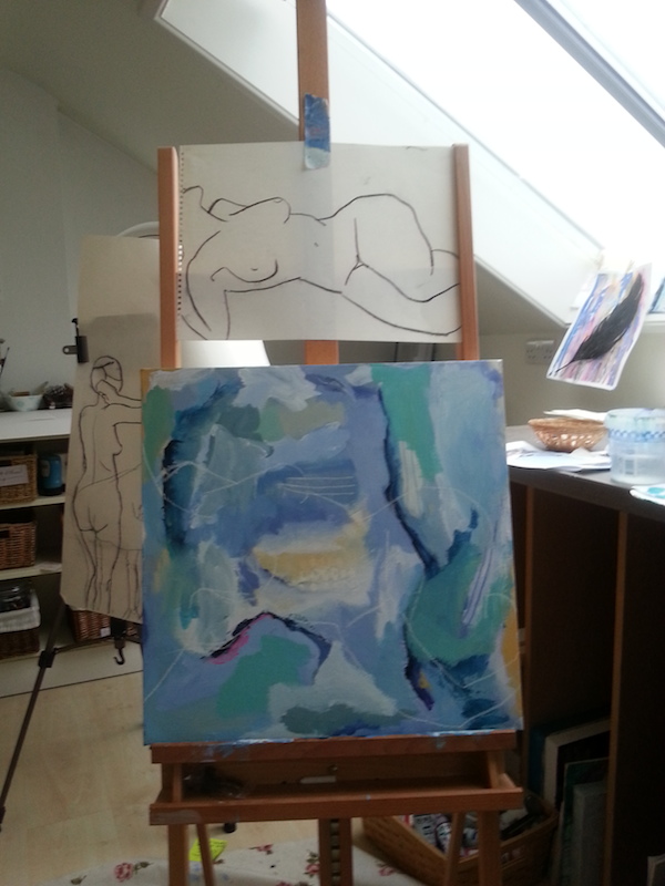
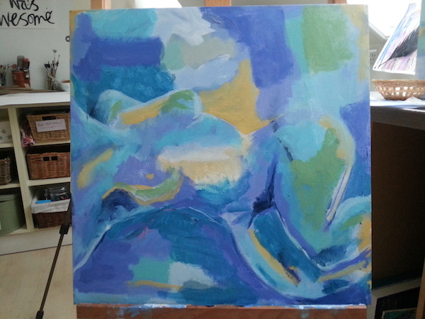
As you can see, I started with another old figure drawing from {my} days of yore. I mapped it out with chalk onto my background.
Rather hilariously, I discovered after a few days that this figure was not really from a life drawing class {as most of my figure sketches are}, but from a famous painting by Modigliani which I found lying around in my studio. It was also easier to work from than a few lines, much as I loved them.
I had Lavender nearby as I wanted to keep as close to the original palette as possible. It’s amazing how you can lay out the same colours and come up with really quite a different colour scheme.
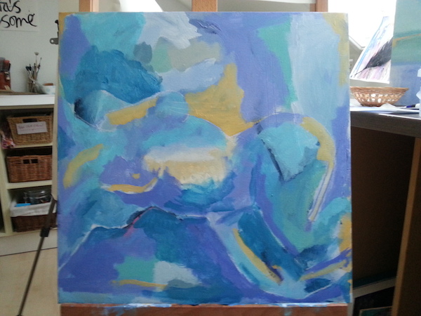
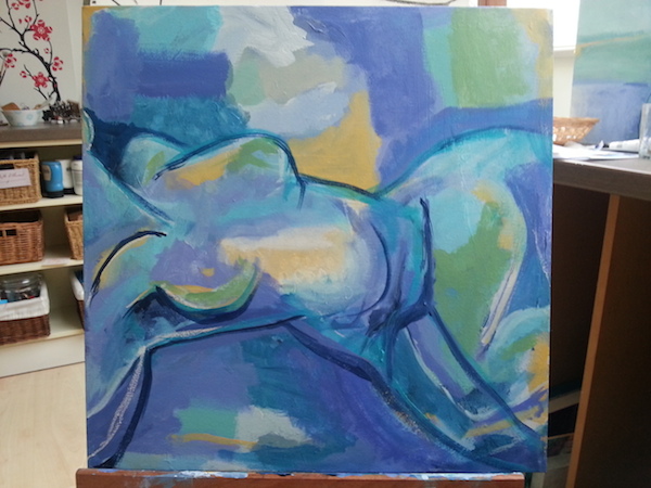
I wanted more yellow {any excuse for a bit of Naples Yellow}, so once the figure was sketched in I took it around the canvas, in both the figure and the background for cohesiveness, as well as some other colours mixed from the palette.
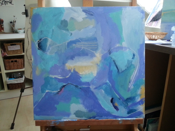
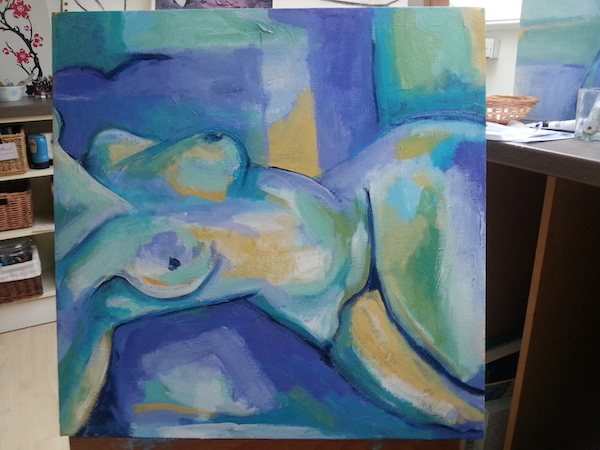
I like my figures to be intentionally distorted, but for a while she also looked uncomfortable so I had to rework the middle section and thighs a couple of times. I don’t mind if it’s exaggerated but I want to feel comfortable when looking at her, otherwise it’s jarring and detracts from the experience of the painting.
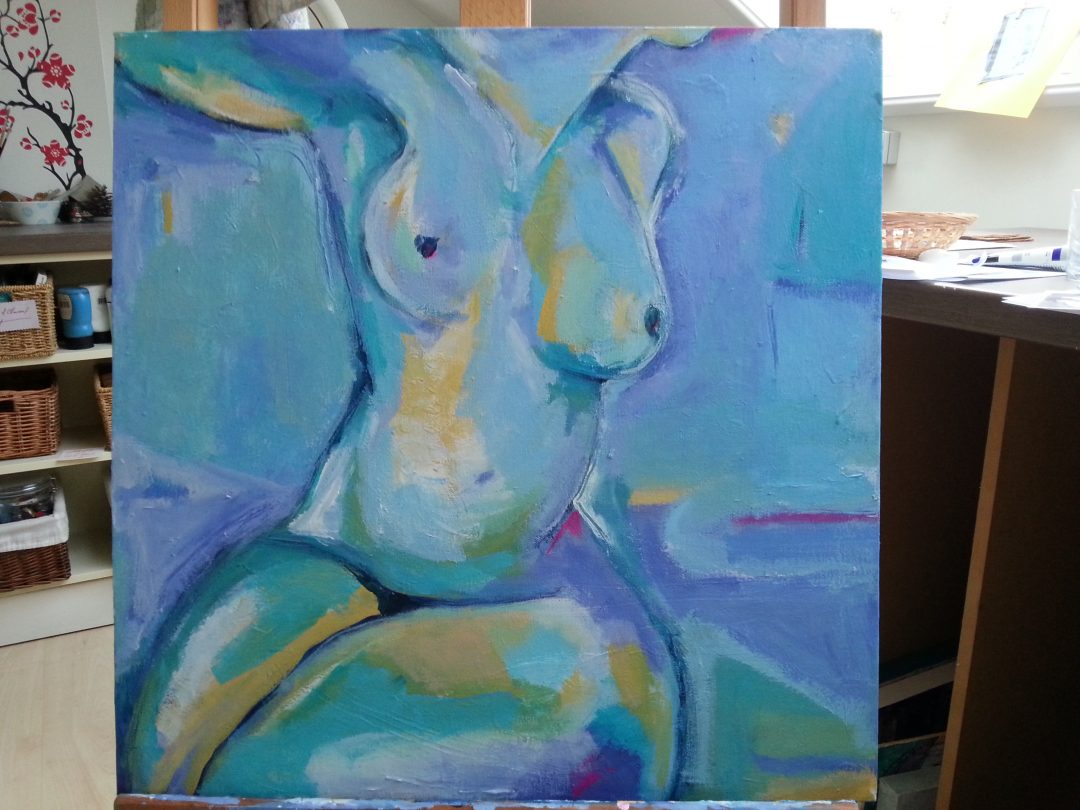
Here {above} you can see I went in with some dark outlines. It astonishes me how from one painting to the next I can forget how I created certain effects; even with Lavender right next to me I couldn’t quite grasp how I’d managed to outline her without apparently outlining her. There was a lot of pausing and studying and trying things out.
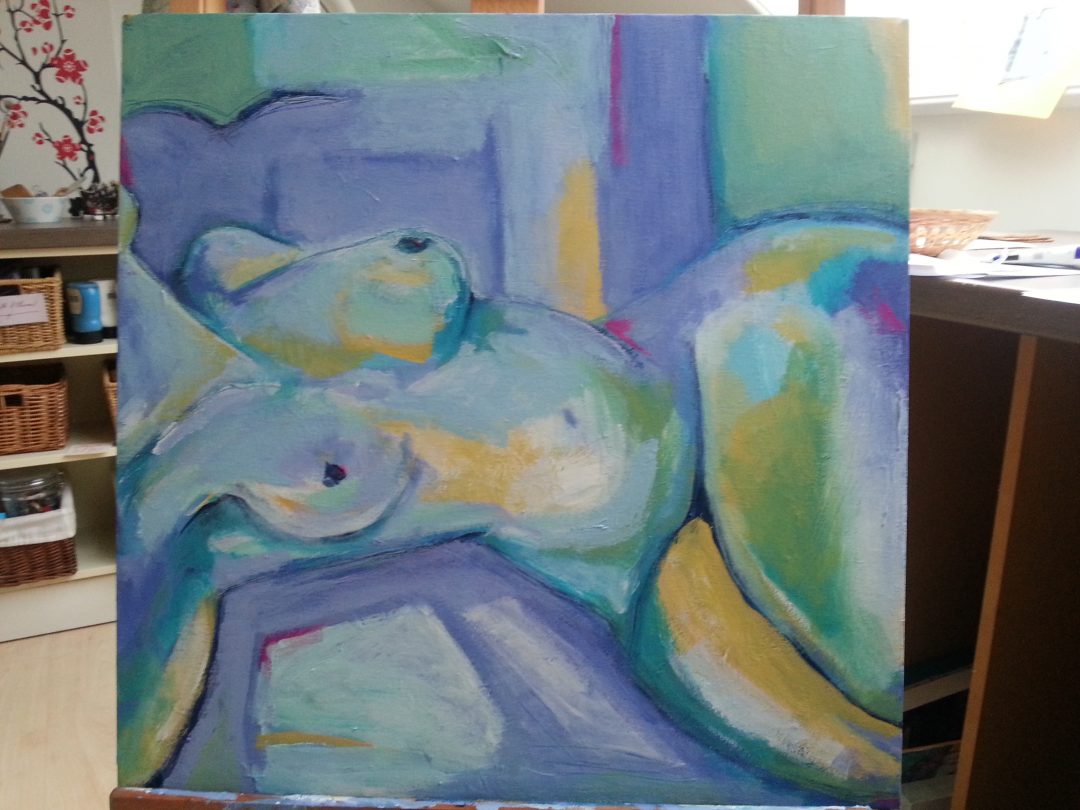
Still something wrong with her lower abdomen where it rests on the surface she’s lying on {above}. It was all I could see when I looked at it so it had to be adjusted.
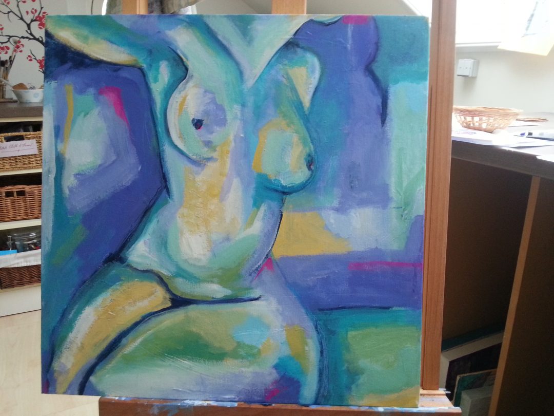
I then discovered, in the process of turning the canvas to check for balance, that I MUCH prefer her this way up! Also with some fluorescent pink, which is fast becoming a favourite.
I kept working the background over and over, trying different shapes and colour mixes, turning her round and round. The more I do this the more I refine my eye in terms of feeling in my bones when something isn’t quite right. The beauty of layers is you can just keep going til it clicks.
There were MANY moments where I just wanted to call her finished, but the nagging sensation told me she wasn’t done yet.
And then she was.
omg Tara… this is my favorite of your paintings so far.
Love the composition, and of course, those yummy colors.
Fabulous job, girl!! YOU are fucking talented. i love all the angles in the background. Contrasts with the curves of her body. Love love. xox