“Composition is the art of arranging in a decorative manner the diverse elements at the painter’s command to express his feelings.”
Henri Matisse
I have a theory that we all have a natural ability to create compositions that work when we follow our intuition. However, that isn’t always necessarily easy, especially if you’re not feeling particularly confident, are out of practice, or just starting out.
That’s why it can be helpful to know some of the widely used and effective compositional styles, so you have a reference or springboard. I shared three in this post, but there are many more.
I don’t recommend rigidly deciding on a composition before you begin and trying to make your painting squeeze into it. 😉 It’s not something to set in stone, nor do you have to use only one per painting! But you can take note of the paintings that activate a response in you, and notice how they are arranged and what impact that has. Then you can try using those in your own work, while allowing them to evolve where necessary.
A strong composition grabs the eye and guides it confidently around the painting. It makes the focal point clear, while offering an interesting and satisfying experience wherever the eye lands.
So here are three more compositional styles to add to the ones I shared before.
L Shape
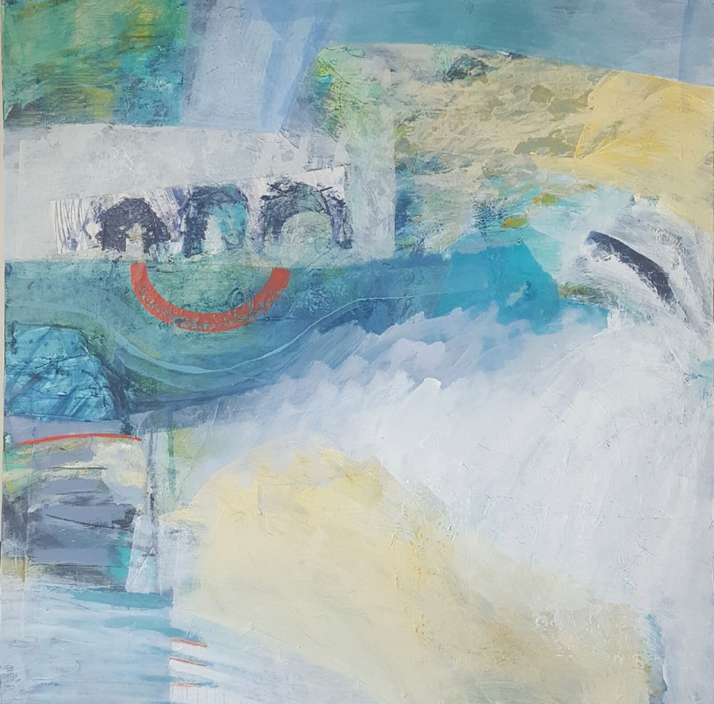
The beauty of the L shape composition is that you can use it any way up. In my painting below, the L has been turned so it goes down the left hand side of the canvas and across the top. The L shape allows for plenty of open space, which is why I love it, as that’s something I try to create in my work.
You can see then how composition can support what the painting is saying. It can contain or suggest space, give direction and move the eye.
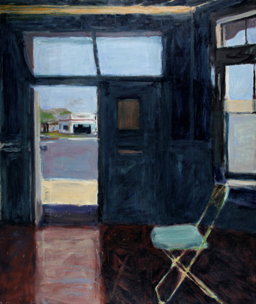
In the painting below by Richard Diebenkorn, the L shape is created by the windows. If you flatten the image in your mind’s eye, you can also see a grid composition, which is when the canvas is divided up into {often irregular} squares, like a patchwork.
Triangle
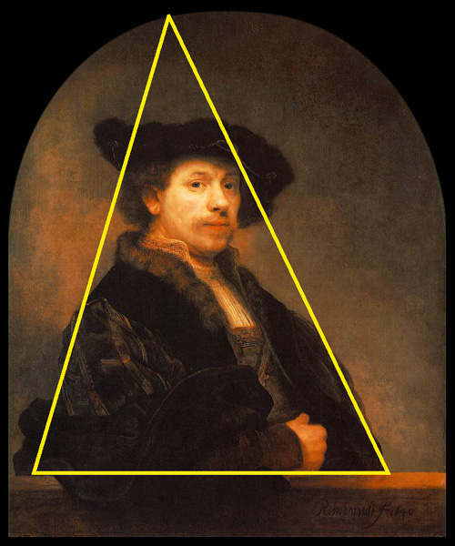
The triangle composition can be used and interpreted in various ways, I’ve found. The shape itself creates a solid and stable base, making it effective for portraits, as seen in this one by Rembrandt, onto which someone has kindly popped a shape to illustrate. {And notice it doesn’t have to be an equilateral triangle!}
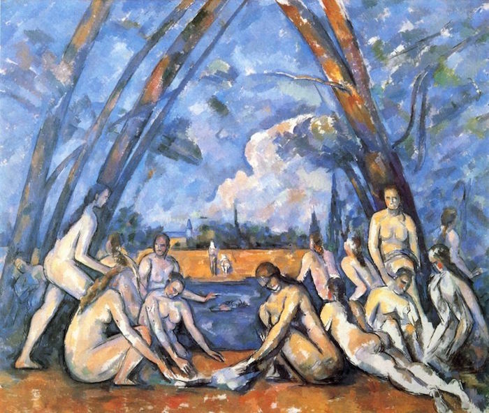
In the painting below by Cezanne, the triangle composition created by the trees echoes the diagonals of several of the figures, and creates a kind of frame within the painting, revealing the distant landscape but bringing our eyes back to the figures in the foreground where most of the action is happening.
Cruciform
Cruciform – meaning cross shaped – lends itself well to landscapes, figurative, abstract, and still life paintings, in particular vases of flowers. This painting by Sheila Marlborough is a great example, and shows too that the cross doesn’t need to be centralised. In fact it often works better if at least one element is off centre in the painting.
{See how it works as an L shape too. Lots of mix and match!}
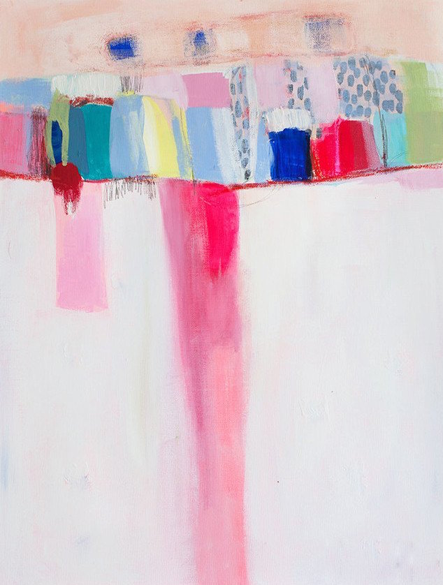
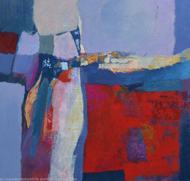
Below is a cruciform composition by abstract artist Lola Donohue. Notice how, like the L shape, it offers an opportunity for leaving some ‘white space’ in the painting {literally in this case}. That allows the eye to rest and the focal area to stand out more.
Do you have a favourite composition? When you look at your work overall does a particular approach keep showing up? Or is there one you’d like to experiment with? Let me know in the comments!
Feel like you could do with a bit more grounding in these kinds of art basics?
Inside the Happy Artist Studio we explore ways to strengthen your art and hone your unique voice through fun, practical, and inspiring courses and workshops, and so much more to support you in developing as an artist.


Most of my portraits, whether traditional or digital, have a subject in the center. I know, booooring 🙂 but it works well for my subject matter.
Drawing across the sketchbook spread forces me to try out different compositions, since the spine cuts the middle, so usually I don’t want to place the face there. I might try some of these.
Not necessarily boring! As you say, portraiture definitely lends itself to a central composition. I’ve been experimenting with drawing across the central crease lately – really enjoying the spacious feel of it!
I needed this Tara. Is the last one a T shape? . I haven’t studied composition but I do like Light or white negative space. One that I’ve used quite a bit is 2 sides with opening. Often I design the areas closest to where the edge of the opening is. At times, I can see abstract figures. Now I’m using mixed media and working small.
It’s easier. Watercolor, inks, wax crayons, pencil, charcoal, markers, etc.
Do people like Twombly or Frankenthaler use composition? They seem to break the rules?
They do tend to all have more than one possible name, yes! Great question – if you look at a lot of Cy Twombly’s paintings, he does use an imbalance in most of his paintings, which often seem to be combinations of compositions. His work is so intuitive it looks like the compositions happened naturally; I don’t know how consciously intentional he was about it. Similarly with Helen Frankenthaler – I don’t think they’re as random as they look.
So simple. Yet effective.
off topic I know… but does anyone get attached to their paintings? I’m not even sure why….. possibly afraid. ANYWAY curious as to others thoughts as well as a possible mantra to help me release them!!
Absolutely! There’s a spiritual principle that says we love what we create {even the things we wish we hadn’t!}, and that applies to paintings too. Some paintings can feel very hard to let go of. I have some I’ll probably never make available for sale because they are very personal and are between ‘me and me’. I find it helps to remember that I can and will always make more! Holding onto them from any kind of fear doesn’t allow any space for new work, and some paintings I’ve found are actually for others, if we can be brave enough to share them!
Of course you feel attached to your work. The best part of you goes into your commissioned works, and the worst part goes into your self exorcisms. What ever was in your spirit that day goes onto your paper or canvas, so a part of you will always be in that work. It’s like a mother training her child to be self sufficient and then having to let go as they step out into the world. You love the idea that someone wants your work, but you also want to keep a work you know is good.
Make copies and sell those, or photograph them and put the original pictures AWAY! You don’t WANT to know how my heart grieved when I found out my–darling husband–took my portfolio out to show off to his friends, spilled a full 44 oz mug of soda all over it, folded it back up and put it back. I found it a month later when I went to add to my collection. Everything I cooked for a month either had mineral oil, cayenne pepper, or both.
I always feel honored when someone wants to purchase one of my paintings and it is wonderful to know someone likes my work good enough to purchase it. I think I can always paint another one
Yes I get attached to my work too, thinking “I’ll never be able to do that again.”
And as to composition, I suppose most of mine are either centered or undiscernible. Some of the random abstracts I do seem to sprawl all over the page or canvas, and I can’t find a form or pattern. Maybe that’s why they have an unfinished feel. Hmmm.
Oh yes I know that one too! 🙂 Especially the ones that seem to happen without a lot of input from me. Which is ironic because those probably are the most ‘repeatable’ if I allow myself to let go when I paint. If you think about Joan Mitchell’s work, a lot of her abstracts have that ‘all over the place’ feel, but still work. This is why composition is so arbitrary in many ways. If you enjoy what you’re making and are happy with it, never mind which composition it is! 😉
Tara, how do work t,l,s shapes? I need paint the main object in this area (following the form) and leave other space in neutral colors. Did I understand right?
Yes – pretty much! Colour palette is up to you though. 🙂