I’ve been doing more in my sketchbook lately, having got into a groove with it during the DailyScapes project. It’s an easy way to make art outside when it’s warm enough, which I love to do because of the change of energy from the studio, and because it has that feel that eating outdoors does ~ something ‘outside the norm’ and therefore kind of exciting and a bit decadent.
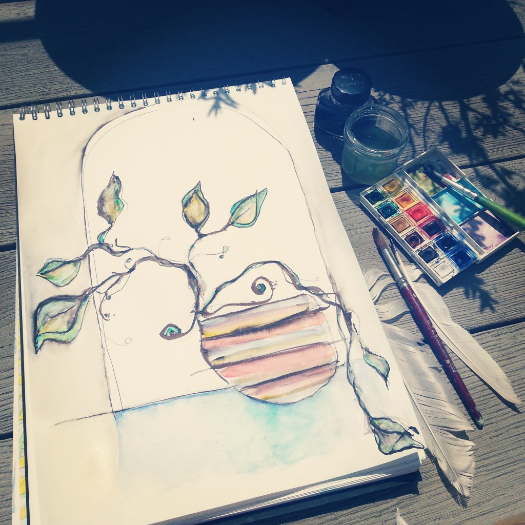
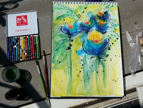
This one, in my largest sketchbook, was really just an excuse to play with my favourite ink and feather, and then to mess about with watercolours. I love how the ink smudged into the colours and knocked them back a bit. And how the feather makes unpredictable thick and thin lines.
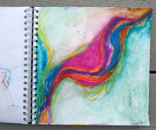
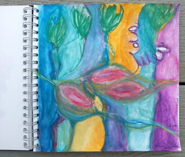
This next one was done with Neocolors and I changed tack halfway through, hence the slightly ‘out of place’ pod shapes in the middle. I’m really loving creating these kind of vertical ‘stripes’ recently, and then blending and softening and toning them down.
One thing my DailyScapes project taught me was that you – or perhaps I! – can push a painting or drawing far further than might feel comfortable. The sketchbook really provides a safe place to practice that, and if it doesn’t quite work out, well, that’s ok. There are parts of this page I love, and parts I don’t, but it’s all learning and was fun to do, so I call that a win.
This one {below} was really fun to do as you might guess! I was thinking about Mary Ann Wakeley’s art, with her organic shapes and waving lines and beautiful colour combinations.
Again using Neocolors and a wet brush. My natural leaning is toward bright rich colours, but I am also very interested in softening and blurring and creating lower intensity combinations. I have to make a conscious choice to do that but I find it’s always worth the extra effort. The fear is that you’ll just end up with mud but I’ve learned that including some neutrals adds a whole new level of interest to a painting, so don’t be afraid of the mud! 🙂
Another thing I’ve been thinking about a lot lately is having another tattoo done. I currently have three {if you’ve watched any of my videos you’ll have seen one of them!}, and if you have tattoos you’ll know how addictive they can be.
So I’m currently in the process of designing my next one. I know where it’ll go – on my left shoulder – so it’s just a case of finding and adapting a design I like {thank you Pinterest}, and then I’ll go and talk it through with a local tattoo artist I found.
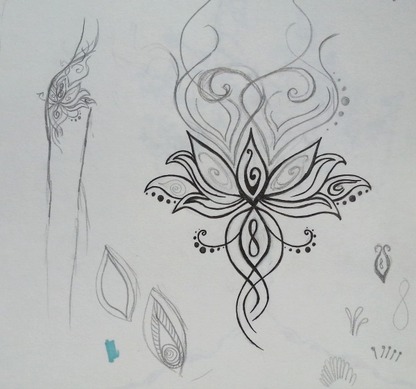
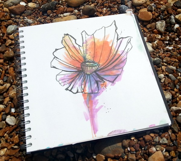
I like to design them myself, but for one this size I’m borrowing from things I’ve seen and adapting them to make it mine. The lotus is not an original tattoo image, but for me the visual and the meaning are more important than anything else.
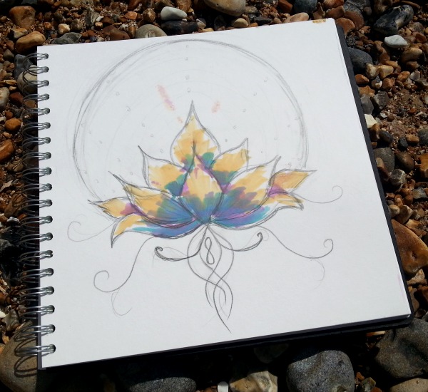
This drawing {below} isn’t actually the plan; it’s more an excuse to play with my new Promarkers. There seems to be a huge trend for ‘watercolour’ style tattoos, with messy outlines and colours that look as though they were splodged and painted on. It can work really well, but seems to be a bit hit and miss, from what I’ve seen.
This one below is heading in the right direction, but needs more experimentation, and I’ll need to get some advice from the dude about what will work.
This is kind of in lieu of a holiday for me this year; I’m not likely to go abroad so I figured I’d treat myself to something else I’ve been wanting for a long time. Besides, when it’s sunny I can just pop to the beach and pretend. 😉
Oh, and here’s one more painting I did on Saturday in the large sketchbook. Trusty Neocolors and my favourite ink-and-feather trick. It’s so fun to make a watercolour painting have more impact with a few random scratches of a feather and some ink flinging. 😉
I love this post and your DailyScapes. I tried something similar from you idea and called it DreamScapes. I really struggle with just playing and only did four then decided they were rubbish. I don’t seem to be able to just let things be what they are if I don’t have an end picture in mind I get stuck and lose interest.
Thanks for all your great posts, I really enjoy them and your relaxed way of approaching your art.
Love that – Dreamscapes! One of the things I set in place for myself when I began was that I would do my best not to judge what I’d done each day. I certainly didn’t like them all! Of course sometimes I was thinking, oh god this is dreadful, but that is part of the creative process! If you need a rough image in mind why not use a reference image? I screenshot images from Instagram regularly to inspire me for shapes, colours, subject matter etc. Just one can be enough to kickstart a new direction. The other thing I’d say is, choose your favourite media. That really helped me.
Great suggestions. I chose watercolours because they are not messy and easy. I have painted calendars for the past two years and would like to do one for 2015, it helps to have some ideas to work from when the time comes. This year I have been really stuck for some reason. I will get back to the DreamScapes and really try not to judge, I know when I go back to paintings of often like them when I didn’t at the time. Talk about doing the same thing over and over!!!! I have printed off todays blog as a reminder to me. Thank you for this great blog.
Just to play devil’s advocate for a second 🙂 – you didn’t say you chose watercolours because they’re fun and you love playing with them. That may of course be the case, but if it isn’t, what about gouache, oil pastels, or even water soluble pens/pencils?
And if the Dreamscapes idea doesn’t seem to be gaining traction, you can always switch gears and try something else, or adapt it! I notice that where things get sticky are where I’ve – often unwittingly – put rules in about what I can or can’t {or should/shouldn’t} do.
Good luck with it Leone! Glad you have found some support here, and I’m honoured that you printed it out!
Thanks Tara, I did choose watercolours because I always come back to them after trying other things. I like the clean colours and the unpredictablility of them. My problem is I want them all to be good. Ha! Ha! I was phoning around and found neocolours so maybe I will give them a try as well. I haven’t quite got to the fun part yet, I don’t know how to PLAY.
Love seeing and reading your process Tara
Thanks Jo!
I have neocolors, I have ink, I have sketchbook … ok, no excuses.
Thank you for inspiring me!
You’re welcome – that makes my day!
These pictures are true eye candy. I LOVE the diagonal neocolor design and the blue flowers; I copied the first tattoo design into my little sketchbook during a break at the office today because it really spoke to me, and I love the softness of the very first one. And now I’m off to figure out how to use a feather (my daughter happened to give me three feathers after I read your post, so I have no more excuses!)
Thank you so much Lin! I found that first tattoo design on Pinterest – I think we all do relate to the lotus and its symbolism and that is a rendering I’m really keen on. And YAY for using your break for sketching! Re the feather – snip the tip off at an angle. Sometimes it doesn’t work so well so either keep snipping and testing or use a different feather.
Love these. Funny thing is in the second one the pod bits are my favourite. My sister arrives from NYC on Monday with my art supplies I ordered including my first set of new colours. Can’t wait to play with them. Tanks for the inspiration
Yay! Art supplies! And actually yes, if I separate the ‘pods’ from the rest of it, I like them too – it just doesn’t work as a whole for me. Thanks for stopping by Deb!