DAPWYL 2 finished in the blink of an eye! I am woefully behind, but I’m ok with that. It’s not like once a course is over that’s it. There were so many rich and fascinating lessons it would take more than five weeks to absorb and integrate them anyway.
One thing I wanted to get a better handle on is working with lights and darks, and loosening my mark making. Pauline had us all playing with apps to manipulate images so that they were easier to paint from.
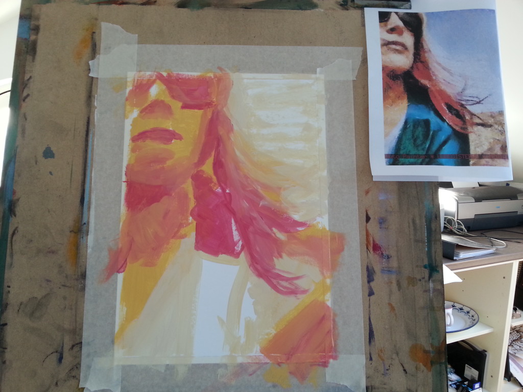
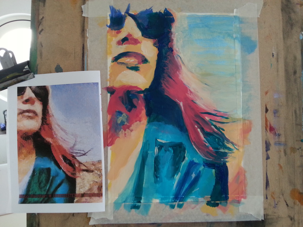
I found this self portrait I took ages ago on the beach and figured it was simple enough and with interesting colours. With a bit of fiddling about in various apps I reduced it down to more obvious blocks of colour so it’d be easier to work with.
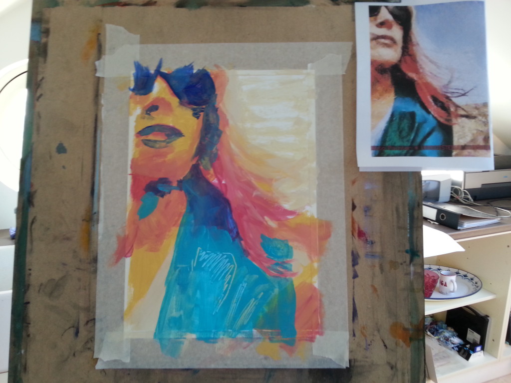
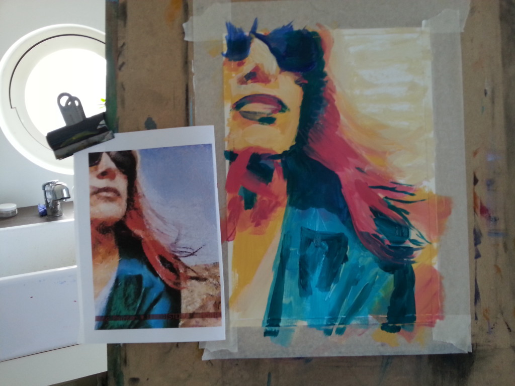
I layered it up from light dark, learning as I went how the darks and lights fitted together without making it too neat, which is kind of my nemesis. It’s weird when the art you want to make and the art that comes out don’t have anything in common. I’m finding I have to be very conscious of what I’m doing, while simultaneously letting it be loose and intuitive to a degree.
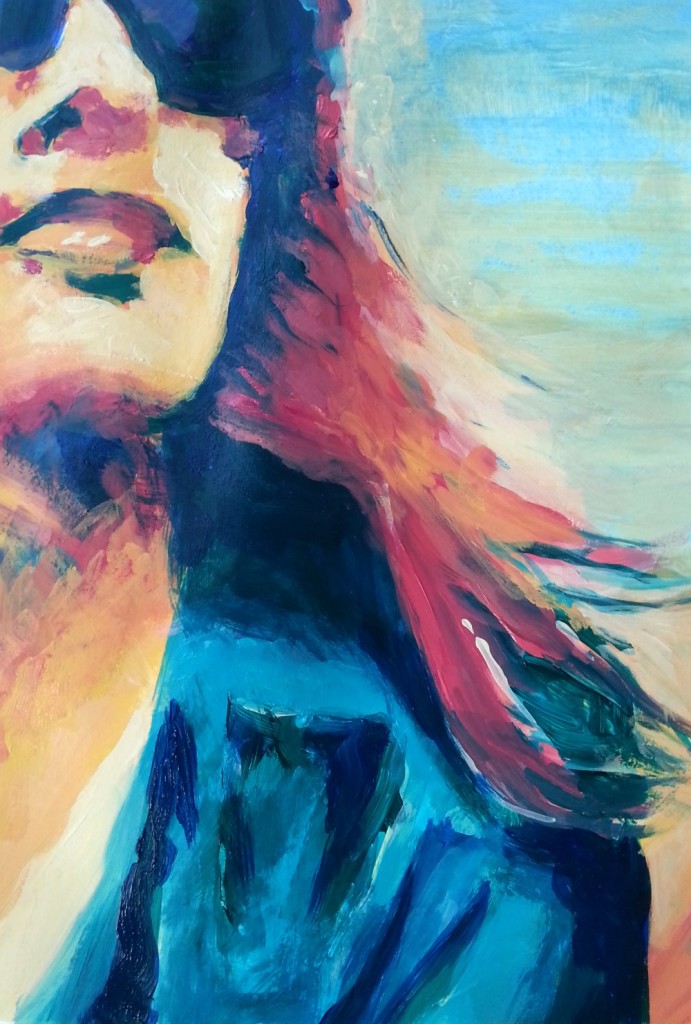
It requires painting over and over each area, adjusting edges and pushing some shapes and colours back while bringing others forward. In focusing on the shapes I was seeing rather than trying to get a likeness, I unexpectedly ended up with a pretty accurate rendition! Close up it looks kind of a mess, but I like that; and then when you step back it suddenly merges together and works as a whole.
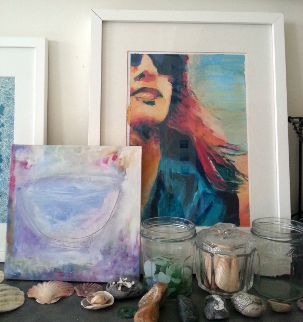
I’m really pleased about how it’s turned out; it is much more in alignment with the kind of paintings I want to be making; looser, expressive, less tight and controlled, and with plenty of colour, and now I have a better felt sense of how to create that. I even framed it {very crappily} so I can see and be encouraged by it every day.
From your description of how you did this — it sounds a lot like life itself really…pushing things here, adjusting there, learning about light and dark…it’s all there…and this is an excellent self portrait!
Your new space is wide open and easily maneuvered…love it!
Yes it does doesn’t it! I hadn’t considered that {for once!}. Glad you like the new look Sherry. 🙂
Love this portrait Tara! And u love what u say about tge painting looking fuzzy from closeby.. I love that too especially while painting.. Gotta keep both perspectives in mind and stay in the moment as a result. Beautiful.
Hi Aarathi ~ thanks for stopping by! I don’t think I’d realised you paint; I’d love to see your work. I’ll check out your site in the Lounge! 🙂
Tara, love you new website home, and I am utterly fascinated by this block color portrait. I find it of great interest how you took a photograph, manipulated in with apps, and then painted. And what a glorious painting it is. Full of freedom and strength. Love it!
Hi Bo, thanks for visiting! I learned this little trick in a recent painting class; definitely helps understand the process.
Fantastic piece Tara! Love seeing how you created it and that you framed it for yourself! xx
Thanks Lorinda 🙂
oh Tara, i love this so much. And this is exactly the kind of painting that makes my heart sing too!! (i still need some work on becoming more expressive – less tight & controlled). You did a great job with this. i would have framed it too. You inspire me. Happy Friday! xox
I’ve been thinking of you a lot with this way of painting P! x
Tara, I love your new website – feels very you, and very spacious. And I love your portrait – really love it. So much feeling and depth – you might want to use the painting as your ‘photo’ on your website. I especially love how you started with a photo, played around with that and then created this gorgeous painting – love the mix of photo and paint!
Thank you Vicky! It is a really interesting and fun process; there’s something about connecting with the image before you start to paint it when you’re using apps that creates a kind of deeper understanding of the shapes and tones. I think that’s why it turned out so well; I was REALLY LOOKING at it for much longer than I might have otherwise.
Oh, I so get you when you talk about ending up with “controlled” paintings. Often I visualise something a bit blury or loose and yet I can’t manage not to go in there and add “realistic” details that just take away the expressiveness of it all. I think I’ll try this technique although painting from a motive isn’t usually my cup of tea.
I think it does take practice, especially for those of us who were maybe taught a certain way, or picked up along the way that realistic art is better. No need to work from a reference image if that’s not your thing. This post might help: https://taraleaver.com/2014/09/loosen-up-your-art/
Lovely! Thanks a lot!