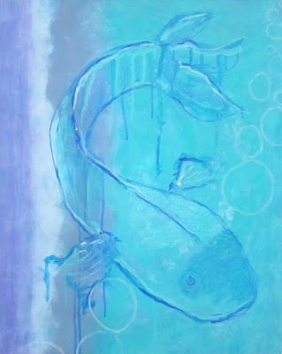
I have been trying to paint with lighter colours. This is going to sound weird but I can’t say why just at the moment (there is in fact a reason!), although I promise all will be revealed at some point. This one is on paper and is about A2 size.
Anyway it nearly killed me using only light colours. Where are my Quinacridone Magenta, my Anthraquinone Blue, Diarylide Yellow, Vat Orange, Turquoise Phthalo?
As we know it’s always good to mix it up a bit and challenge ourselves, and I was pleased in the end that what started in landscape with what appeared to be a moon rising over the sea (great idea, looked awful), has now turned into quite a cool fish in portrait.
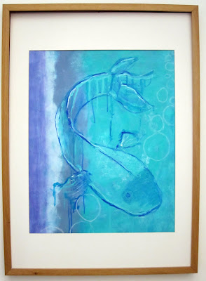
Shocking photo editing but I couldn’t work out how to ‘un-bow’ the edges of the frame, and the colours are somewhat arbitrary! But you get the idea. And don’t even get me started on the whole ‘photographing something framed with glass on it’ thing. I took it out in the end.

I don't know what I'm more impressed by… your art or your spelling!
Photographing glass, mmm I always wonder how they do it! Fish looks surreal x
lovely painting T. i love how you keep challenging yourself! to 'unbow' an image in photoshop, use the free transform tool and then choose 'skew' or 'distort', you can pull the corners straight (or distort whichever way you want, look: (actually, I just tried it and warp worked best on your one, it's a bit of a faff, but that's the way I unbow or straighten anything I wasn't able to scan. xoxo
boo, I just tried to copy/ paste screenshots in but it won't allow. i'll email. xoxo
Lovely, Tara… I love the lightness of the painting. I too find it challenging to use "light" colors…I love the impact of darks but I always admire the look of a soft light painting and think "why can't I do that" lol
I can see what you mean about the seascape – it was looking good – but amazing the way the picture evolved into such a wonderful fish.
Fabulous!
x