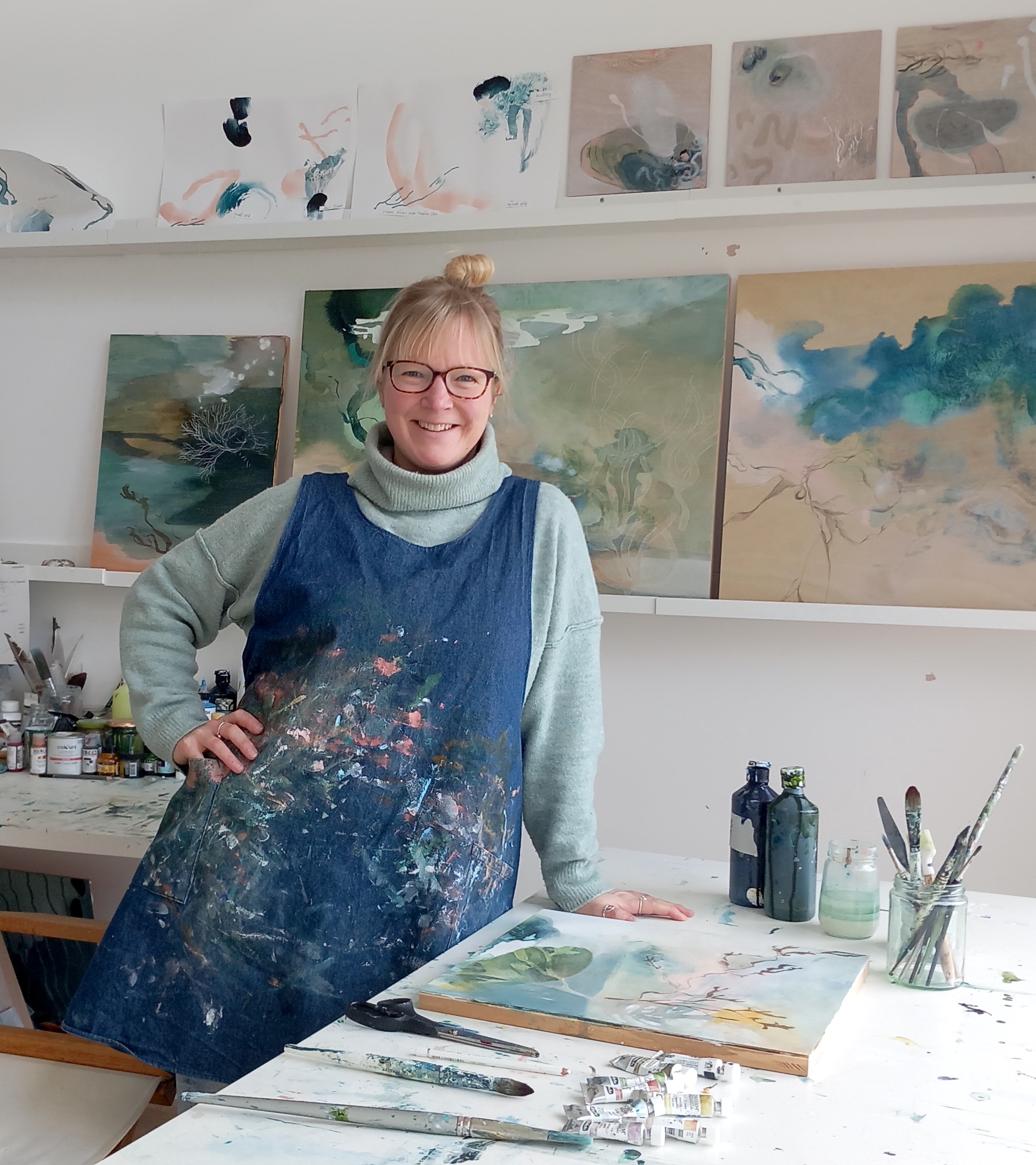
I temporarily forgot how much I hate painting hands for this one. I just really loved the original photo, and spent ages messing with it in various apps until I’d simplified it down to just a few colours and tones.
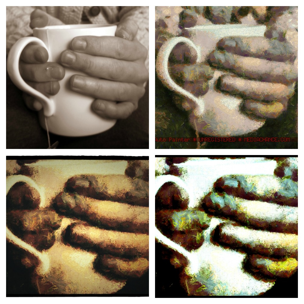
original {made sepia} top left
I also liked the simple, almost abstract look of the image, and the weird scribbly texture I’d ended up with.
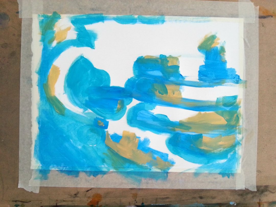
One of the things I love about doing these paintings is starting with shapes. I get a feel for the layout and can just steam in with a light colour to map out what goes where in a very rough and ready way.

A lot of it is experimentation; I’m not always sure what will work, and I might get an idea to blot out some of the colour to let what’s underneath come through {as above, bottom left of the photo}.
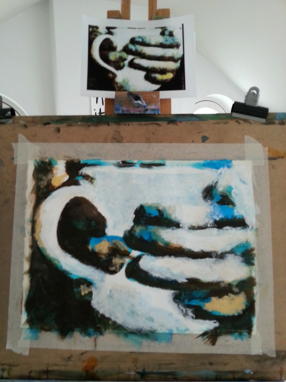
I also squint a lot, as I’ve found that’s an excellent way to get an understanding of the tones. Thankfully I welcome laughter lines; people will probably think I’m wise when really I’ve just been scrunching up my face while painting.
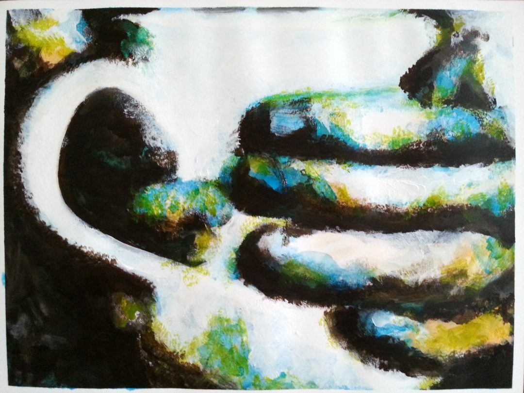
As ever, it’s not intended to be a perfect rendering, although I did want some degree of accuracy so a viewer could actually get an idea of what they were looking at. It was interesting deciding where to put the smoother areas and working out how to create that mottled textured look, and how they make each other stand out.

Loving this… I never thought to use apps to pre-modify images – what a great cue! It removes the ‘realism’ aspect and shuts up the inner critic (at least for a little while, haha…)
Thank you for sharing, Tara! You’ve inspired me to delve into my own photo collection… 🙂
I didn’t either Carina, until I took the art course that taught me! Glad you’ve been inspired!
More than the finished product Tara, I love the process you go through…and even more importantly, I love that you are willing to give it a go. You don’t like painting hands and yet you did it anyway. That is inspiring and encouraging!
Ha, yes, well I’d forgotten about my particular dislike of hands until I’d already started, and since that’s what it was all about it was a bit late by then! But yes, always good to push your own boundaries a bit. 🙂
You really did a fantastic job on this piece Tara! I hope you are ridiculously proud!
Thank you so much Lorinda!